Kjosk
UX/UI Design: a power-bank rental app
My task was to develop the concept for a power-bank rental service. The user's touchpoints with the service are Kjosk stations equipped with a touchscreen and payment terminal, located around the city, plus an Android/iOS mobile app. An additional task was to build a system for customer-support staff. The registration and rental process had to be designed separately for the Kjosk stations and the mobile app. The biggest challenge was maximizing the service's availability and simplifying the rental process for a user whose smartphone is dead, who has no Kjosk account and wants to rent a power bank. I also had to anticipate scenarios where the user already has a Kjosk account but a dead phone and wants to rent as fast as possible, and to plan for as many edge cases as possible — an expired linked card, payment problems or hardware damage.
1. Discovery — User research
I wanted to learn what people do when their phone dies while they're out: how they cope, whether it changes how they use their phone, and whether they feel discomfort at losing contact with the world. I was also interested in their experience with sharing services (scooters, city bikes, car-sharing). I ran in-person interviews with representatives of generations X, Y and Z. The quantitative study showed I should focus primarily on Gen Z and, to a lesser extent, Gen Y. From the interviews I learned, among other things: • Users fear their phone dying and losing contact with friends • They worry they won't be able to use navigation in an unfamiliar place • They carry their own power bank or ask to charge their phone, e.g. at a bar • They dislike permanently carrying a heavy power bank, or forget to charge it • They often use other sharing services but feel stress about whether the rented vehicle was returned correctly
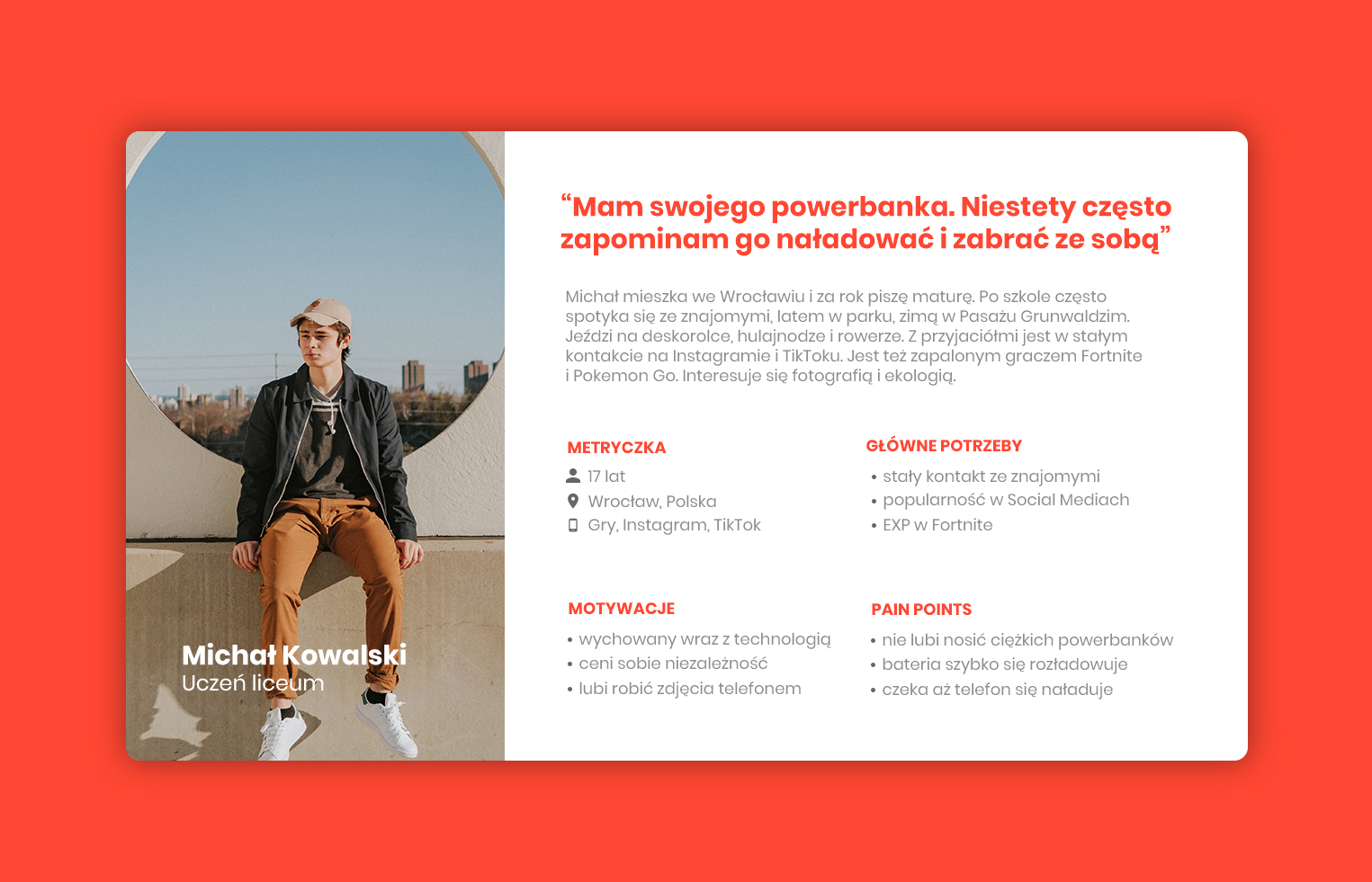
Persona — Meet Michał
I used the research and interview findings to create a fictional character, Michał. This helped me better understand how I could help him reach his goal of a charged phone and freedom from power outlets. Michał Kowalski, 17 — a fan of games, scooters and social media who values independence and wants to stay in constant contact with friends.
2. Define — Information architecture
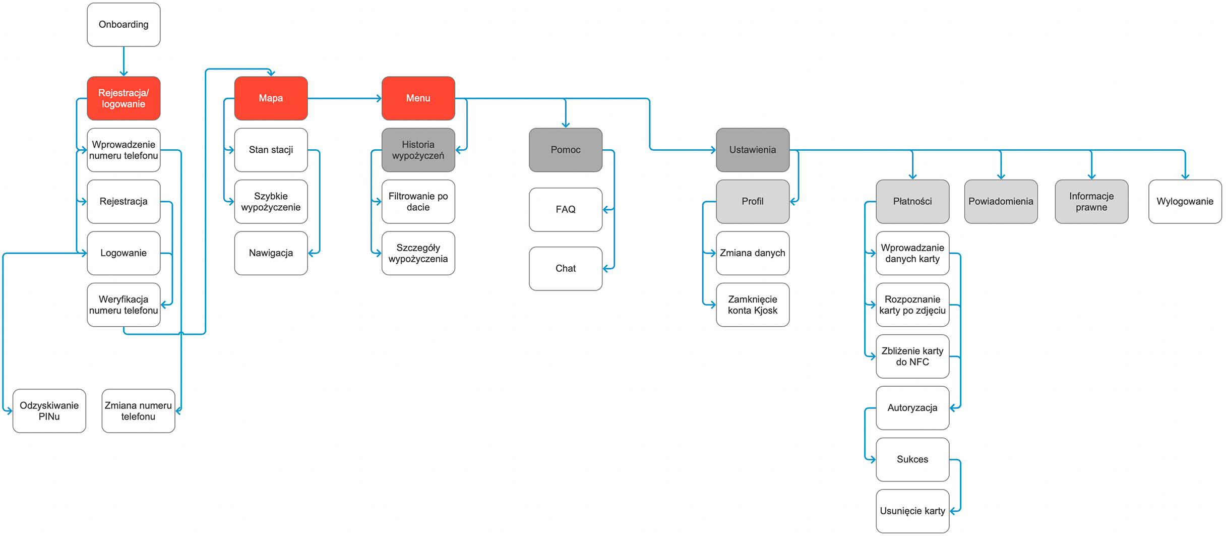
Having identified a solid set of core features, I mapped the information architecture for both the Kjosk station and the mobile app. This let me visualize the hierarchy of major and minor elements. Key product questions (How Might We): • How can Michał rent a power bank for the first time without an account? • How can Michał find the nearest Kjosk station? • How do we guarantee Michał a free slot to return the power bank? • How do we let Michał send a Kjosk invitation?
User flow
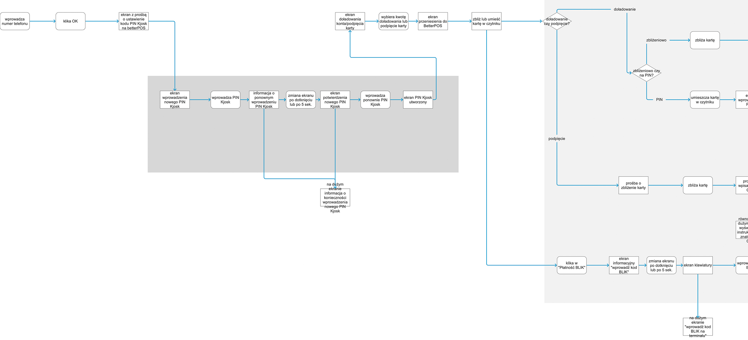
I developed a user flow that delivers a smooth, consistent experience across the whole process — from registration, through adding a card, renting a power bank, navigating to the next Kjosk, returning the power bank, to collecting feedback. I created the user flow both for actions starting in the mobile app and at the Kjosk station — preparing each flow for new and returning users.
.jpg)
3. Ideation — Wireframes
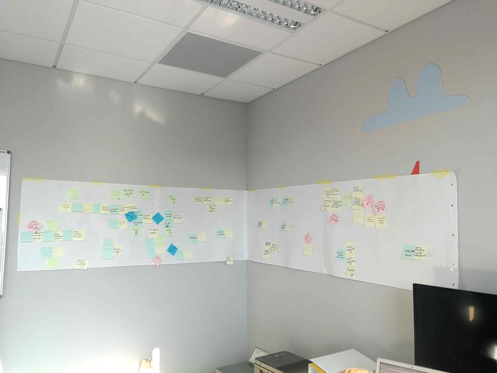
By this point I had gathered enough information to start sketching wireframes. The big, completely empty wall of our office turned out to be the perfect place to lay out sketches and connect them with yarn. During this process I tested every possible usage scenario of the service and, most importantly, the interactions between the mobile app and the Kjosk station.
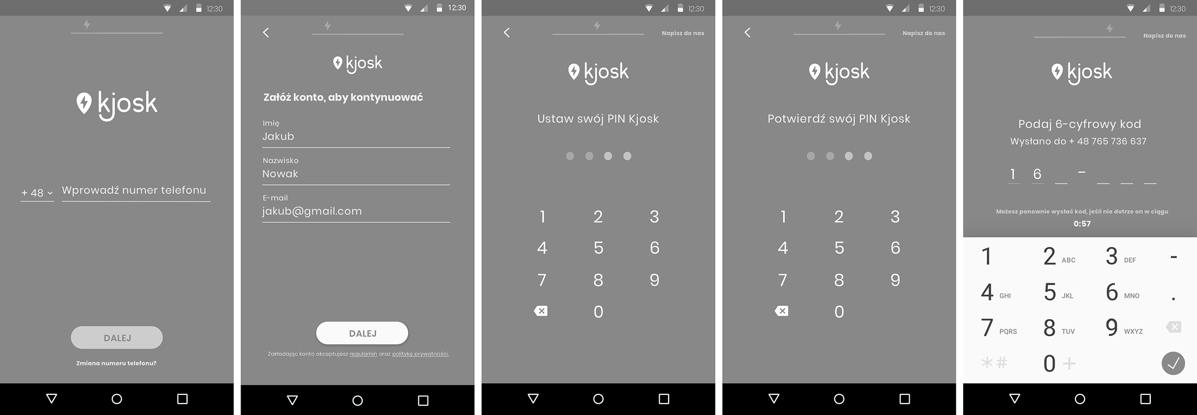
4. Prototyping — Registration
At this stage I prepared clickable mid-fidelity prototypes. Below is the prototype of the new-user registration process.
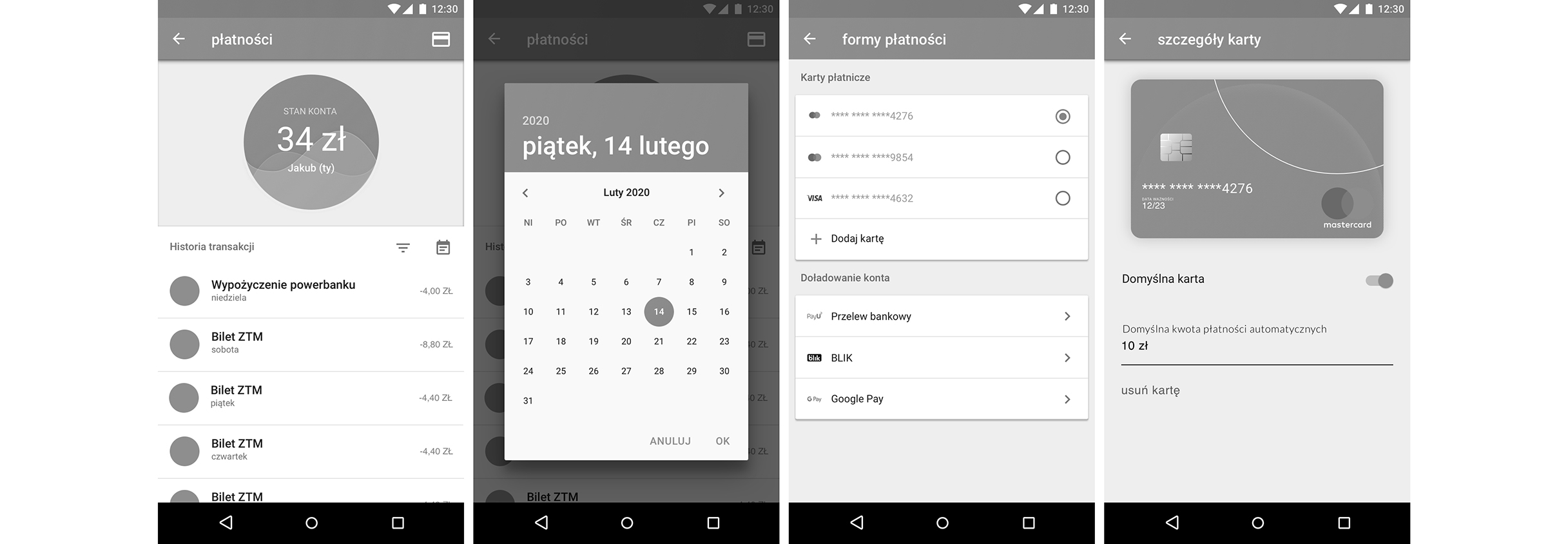
Prototyping — Payments
Prototype of adding a payment card and handling payments — the key flow for a user without an account.
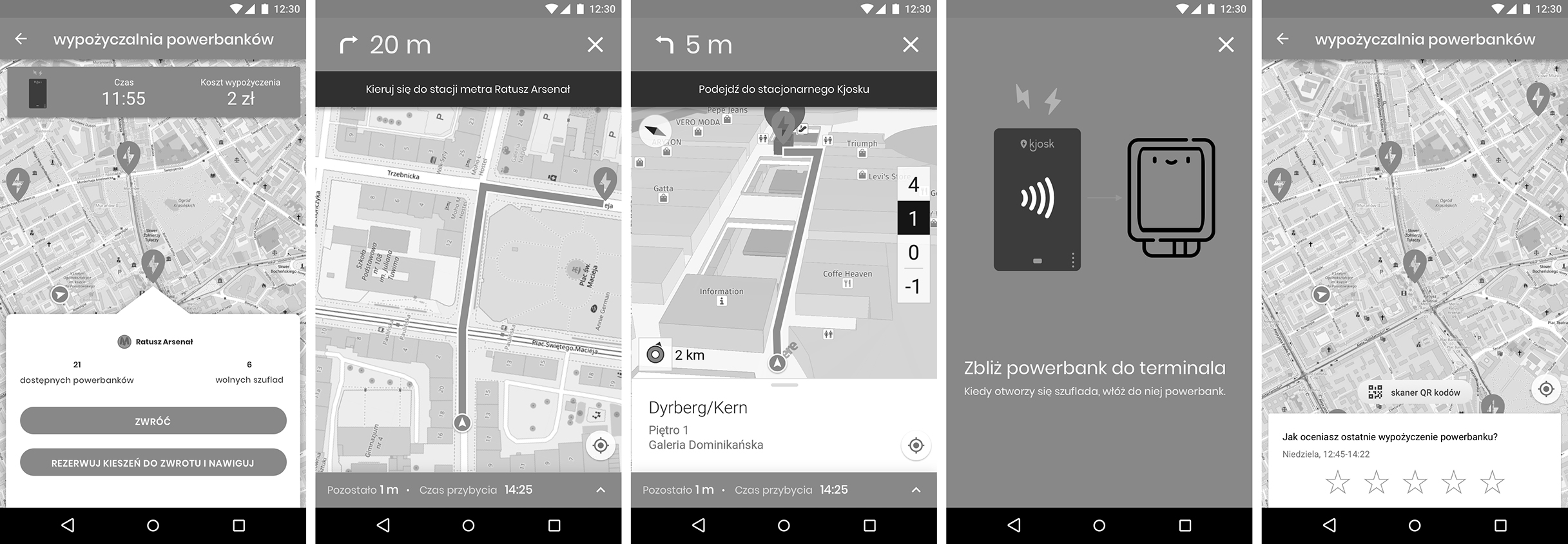
Prototyping — Returning a power bank
Prototype of returning a power bank to a Kjosk station — handling slot reservation and confirming the return.
5. Validation — User testing
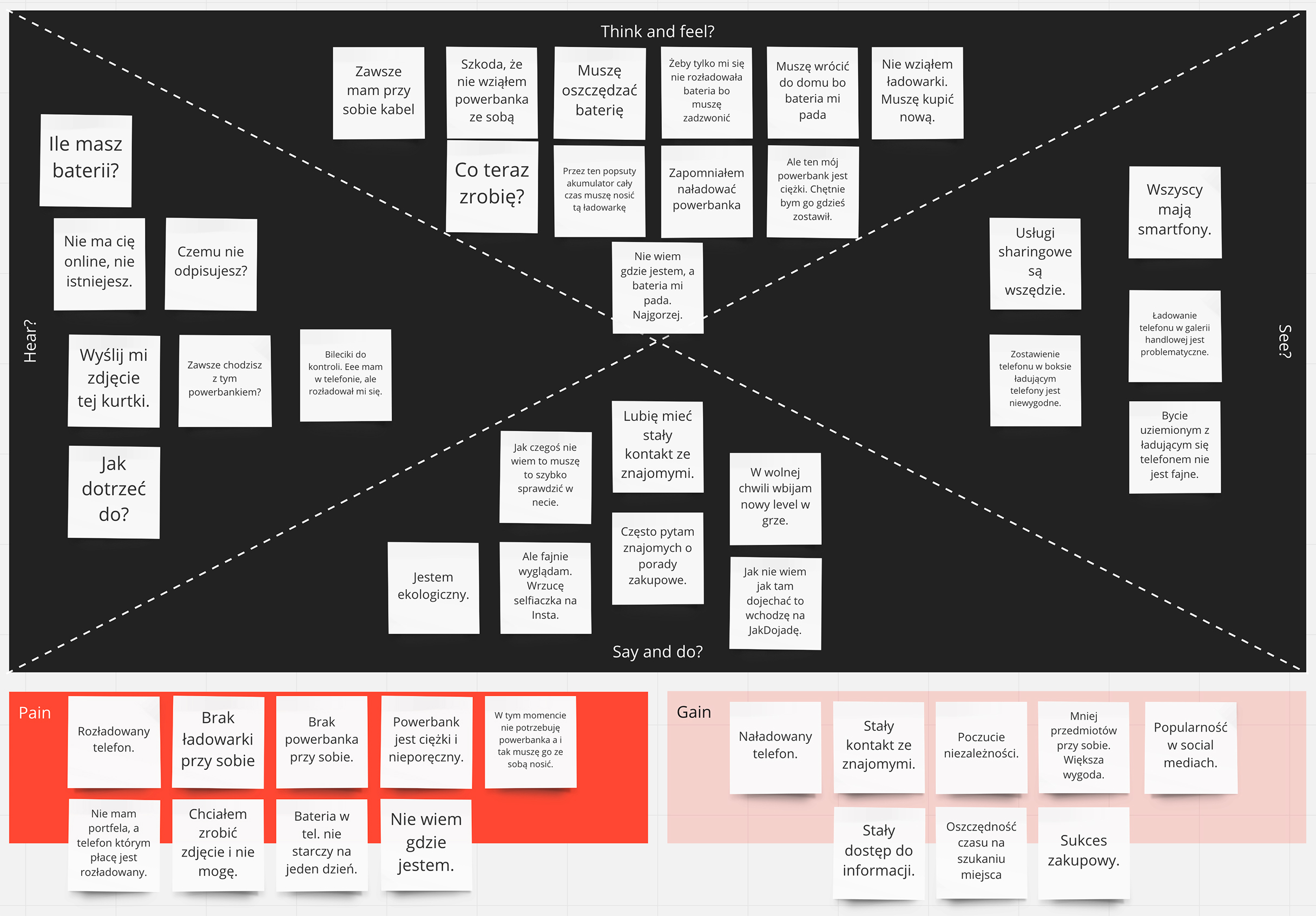
I ran user tests of the mid-fidelity prototype on a mobile phone. I wanted to see how users would perform specific tasks when given a concrete goal. I tested, among other things: • Registration • PIN reset • Renting a power bank • Returning a power bank The tests were extremely valuable. I organized the findings on an affinity diagram to identify problems and potential solutions for future iterations.
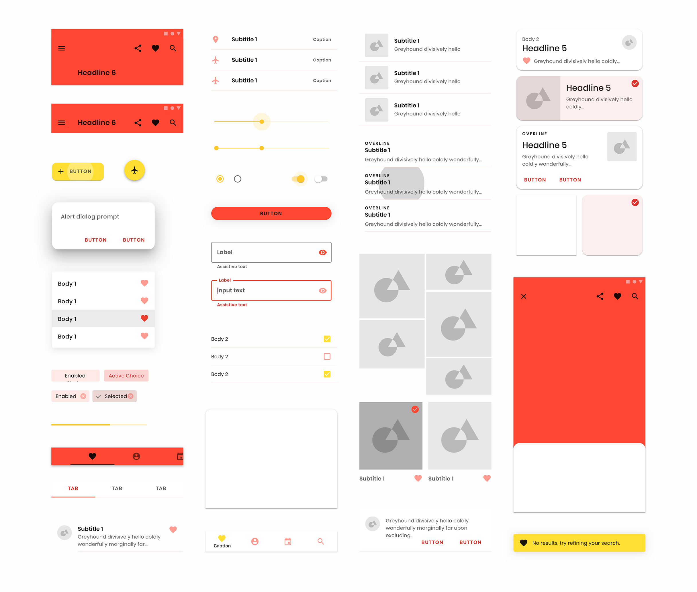
6. UI — Style guide
After reworking the sketches, it was time for the visual design. I wanted to keep a clean design and contrasting colors consistent with the Kjosk brand book.
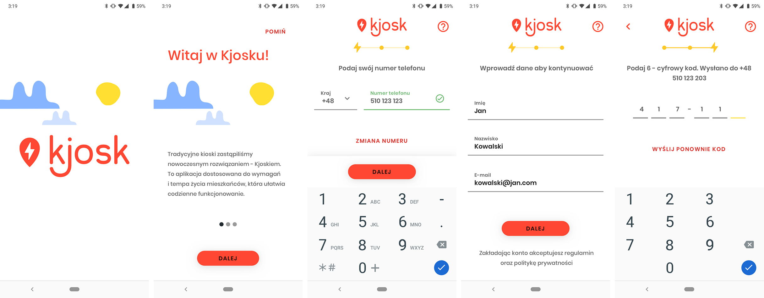
High-fidelity mockups
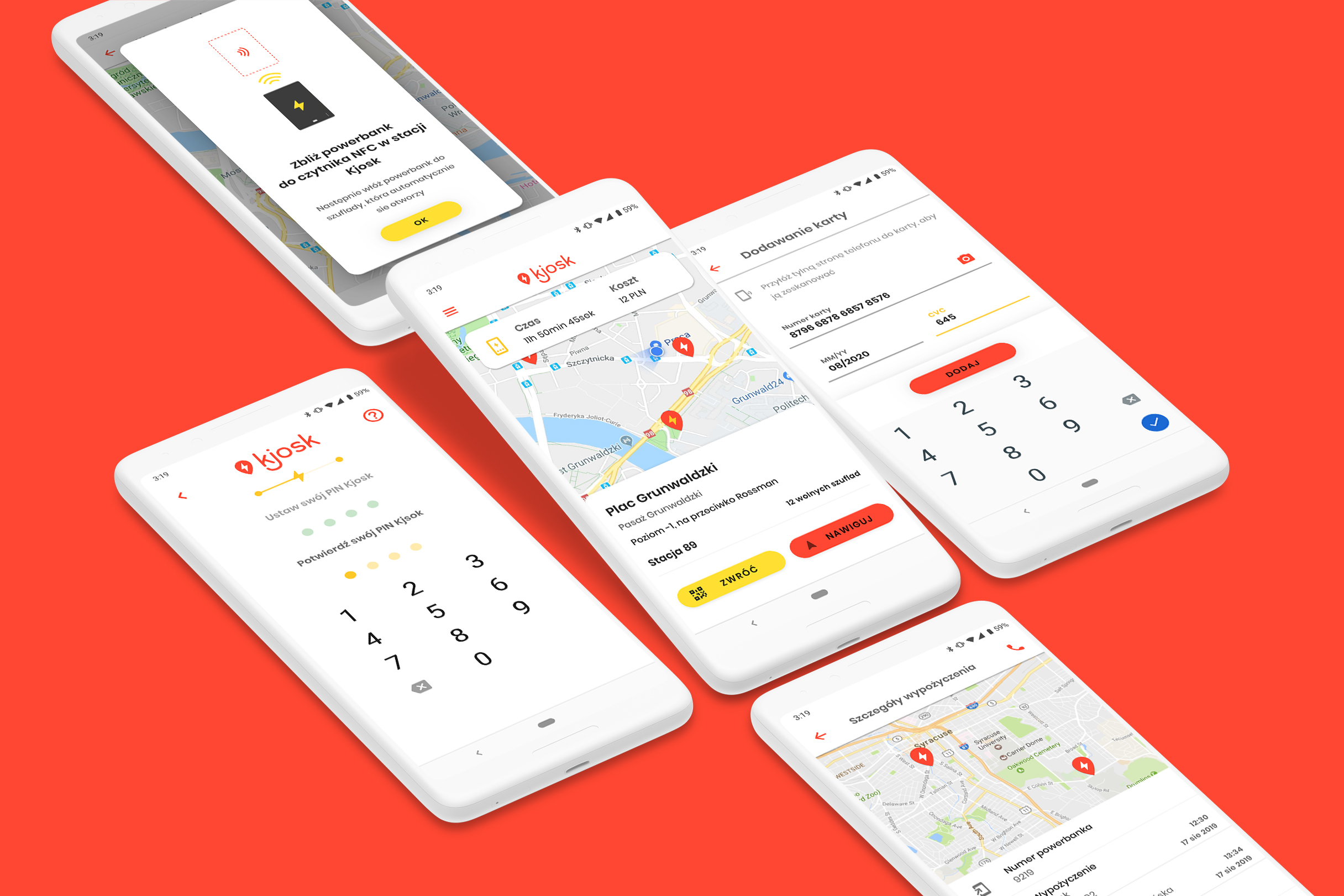
Final, highest-fidelity designs of the mobile app screens and the Kjosk station interface.
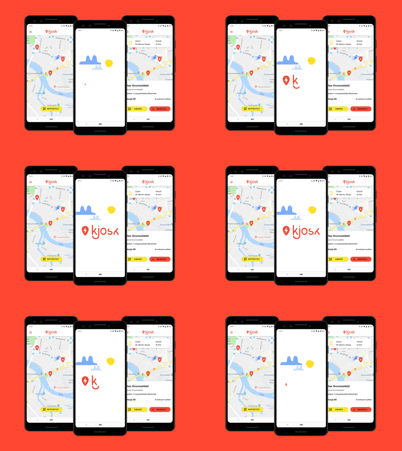
App motion
Transition animations and micro-interactions enrich the user experience and give the app a premium character aligned with Gen Z aesthetics.
7. Feedback — FullStory & measuring success
The design process has no beginning or end. It's about constantly adapting the product to new user needs. For the product to grow, you have to stay in constant contact with users. Feedback tools: • Session recordings via FullStory • Monitoring reviews on the App Store / Google Play • Creating space for open discussion with users Success metrics tracked: • Number of new accounts • Number of rentals • In-app referrals to friends • Average rental duration
 (1).jpg)
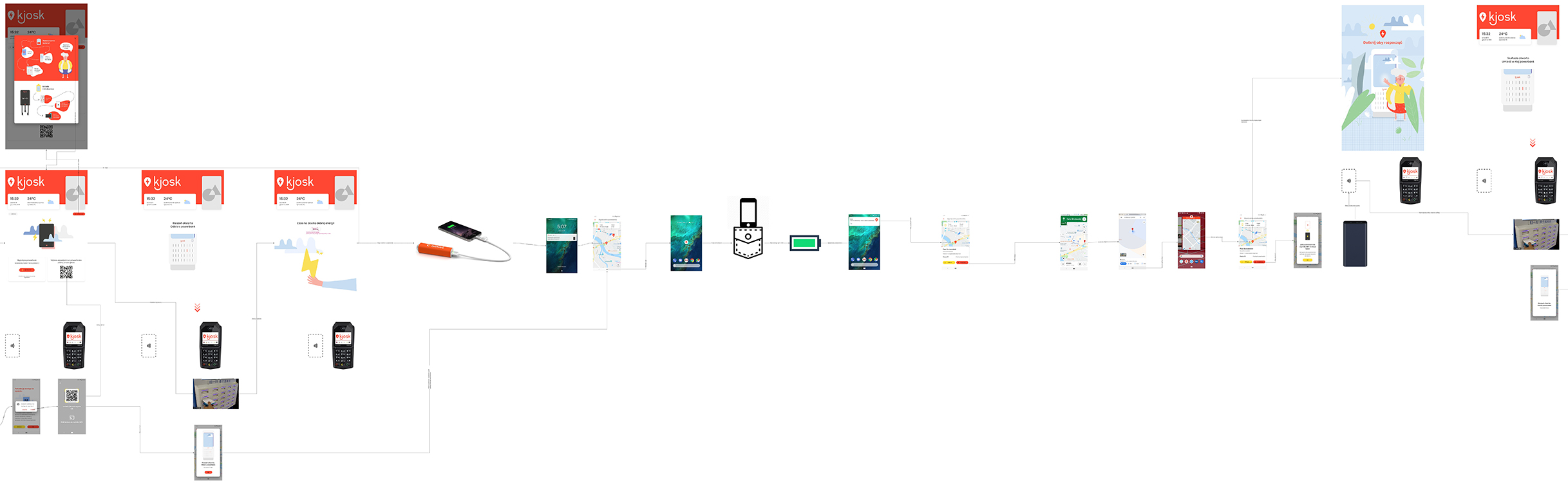
Final interaction flow
A fragment of the final interaction flow between the mobile app and the Kjosk station — the complete user-journey map from discovering the service to returning a power bank.
Summary & team
Building a comprehensive mobile app together with the Kjosk station app was certainly a large and difficult project. I had to create an app that met Gen Z's high expectations while keeping a harmonious flow between the mobile app and the station. Thanks to surveys and interviews, I discovered that most people fear system problems when using other sharing services. I'm happy with the final result — it was one of the most rewarding projects I've taken part in.
zandberg2025.pl
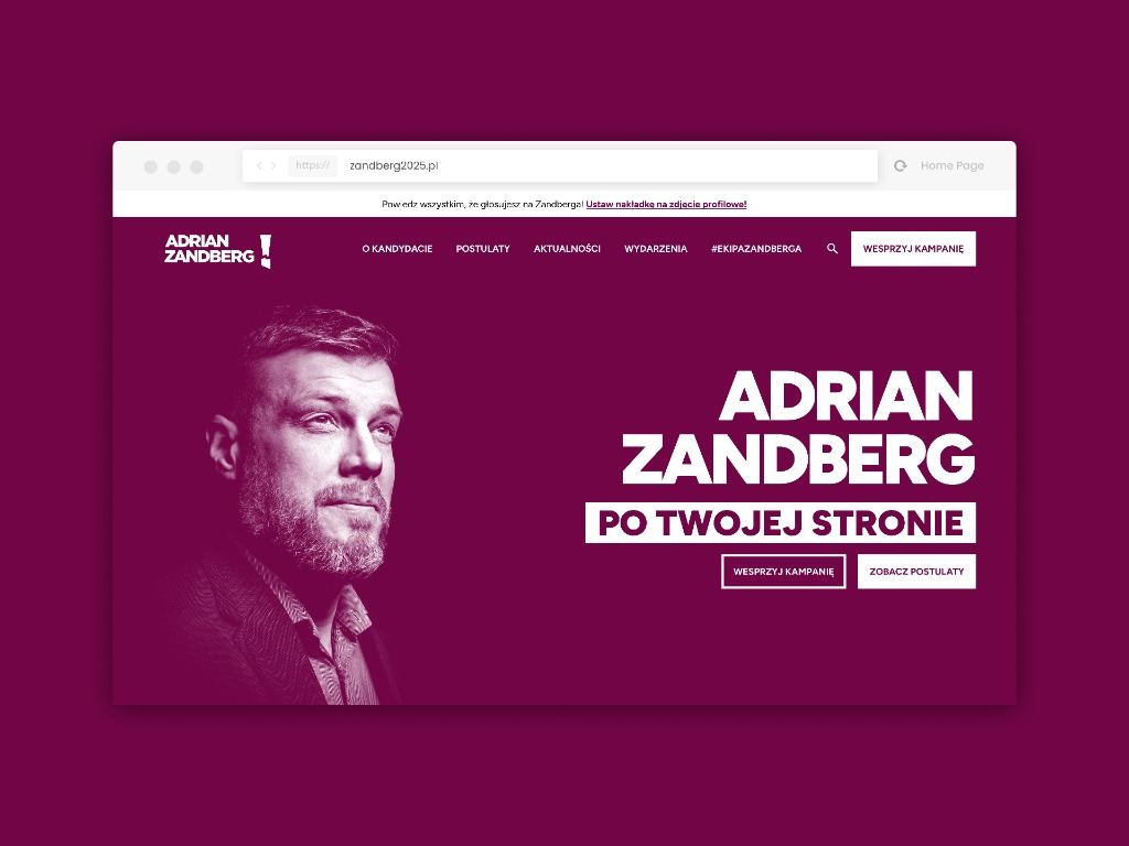
Adrian Zandberg's presidential campaign
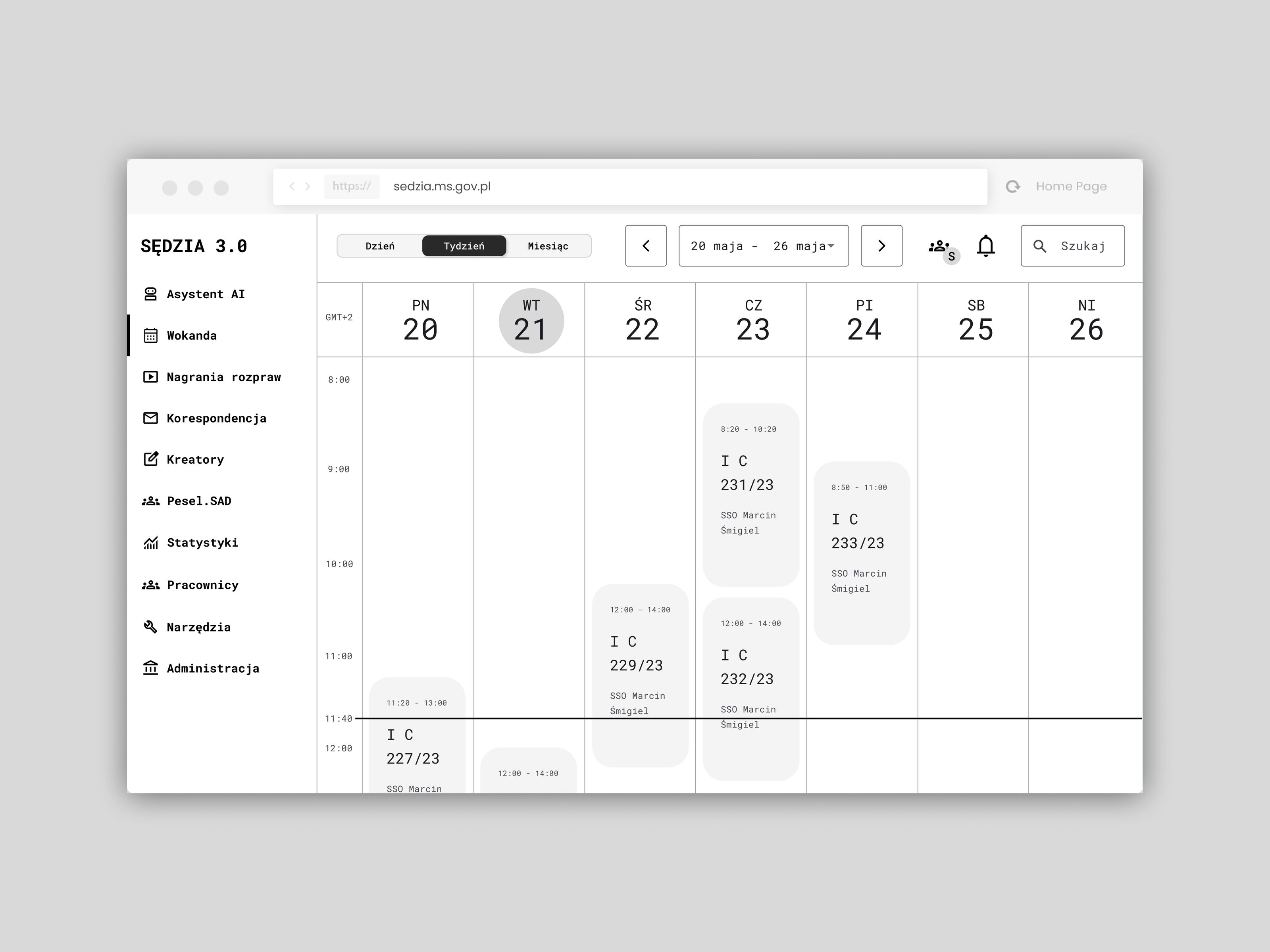
Judge 3.0
Modernizing the IT systems of Poland's common courts — a concept for the Ministry of Justice
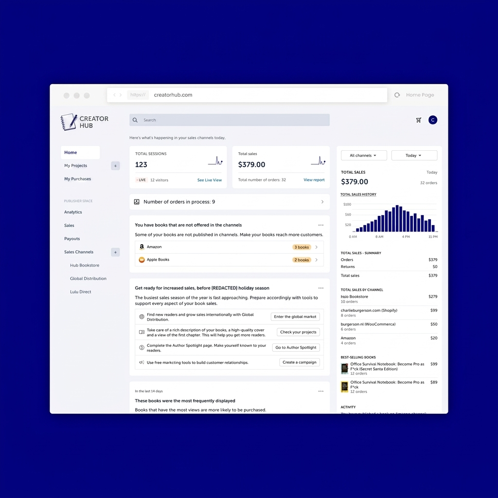
SaaS panel for a self-publishing platform
Redesign of a comprehensive content- and sales-management panel for creators.
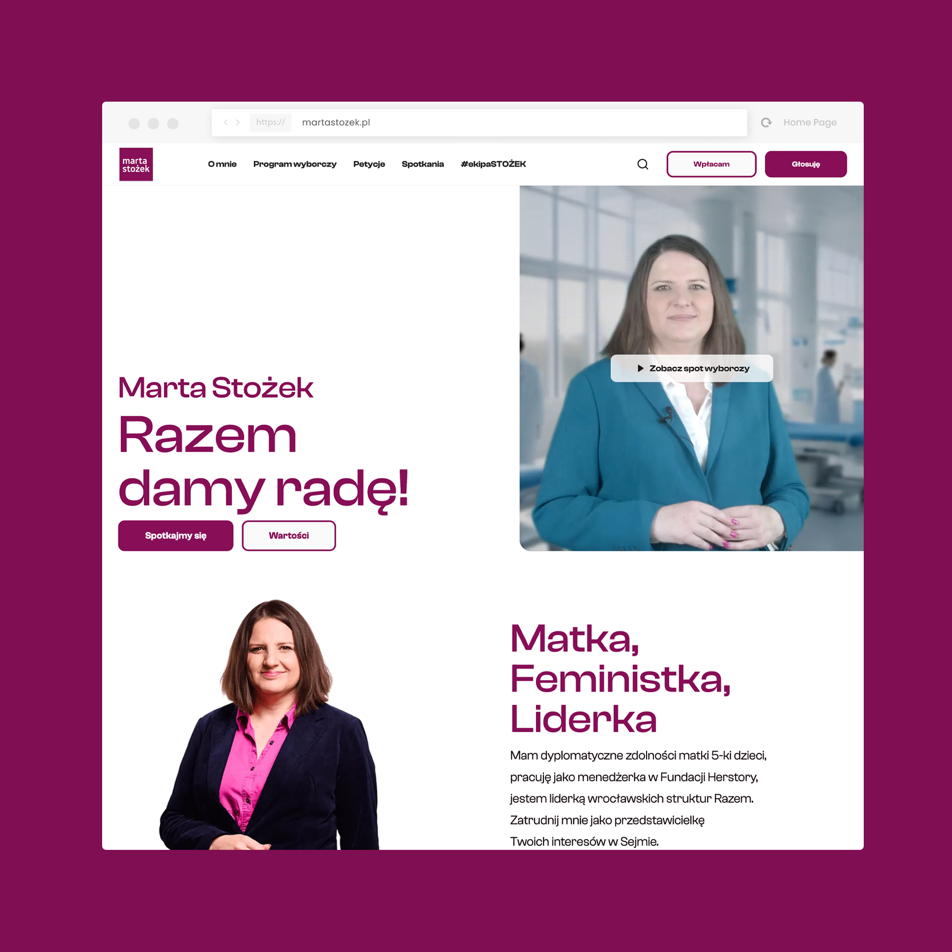
Marta Stożek
Election campaign: from strategy to execution
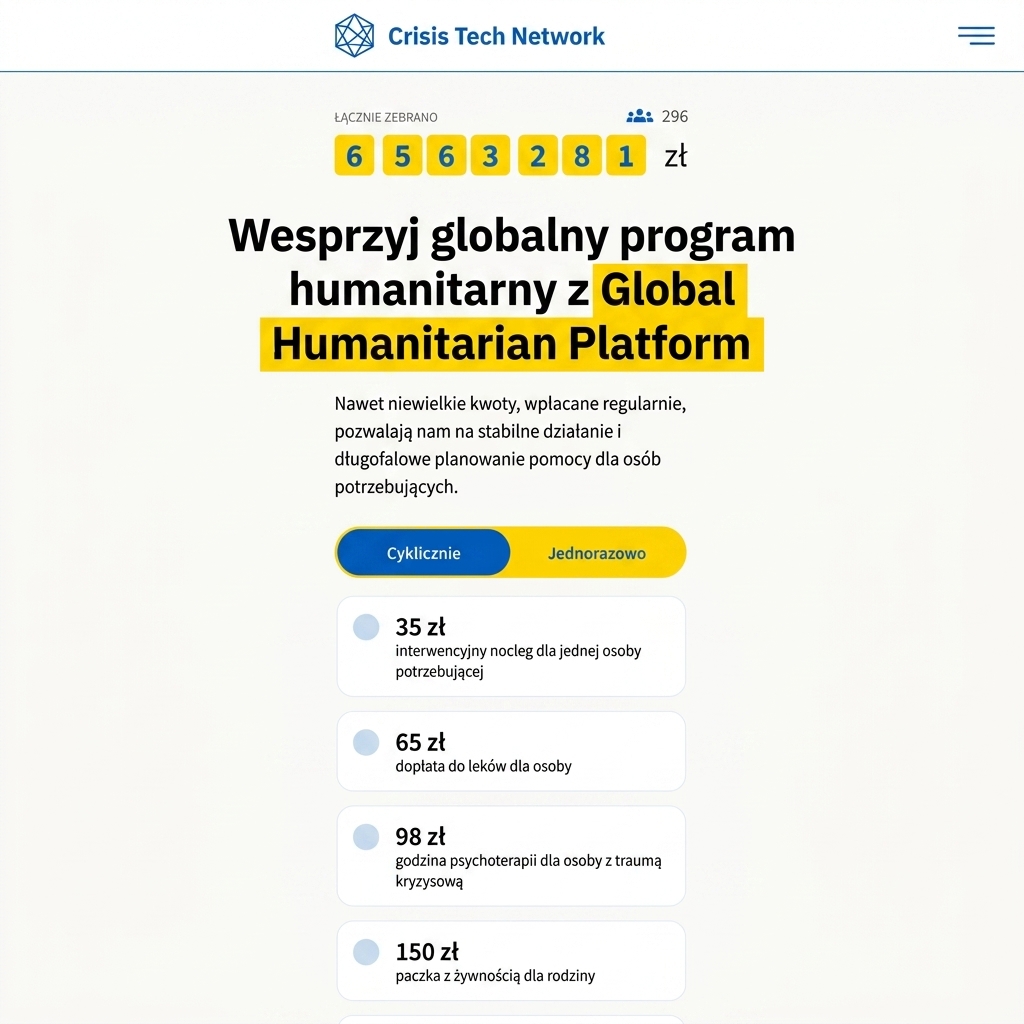
Global Humanitarian Platform
An NGO support project
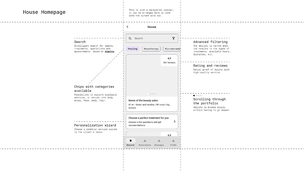
Global Beauty Brand
Salon-service UX concept — protected access
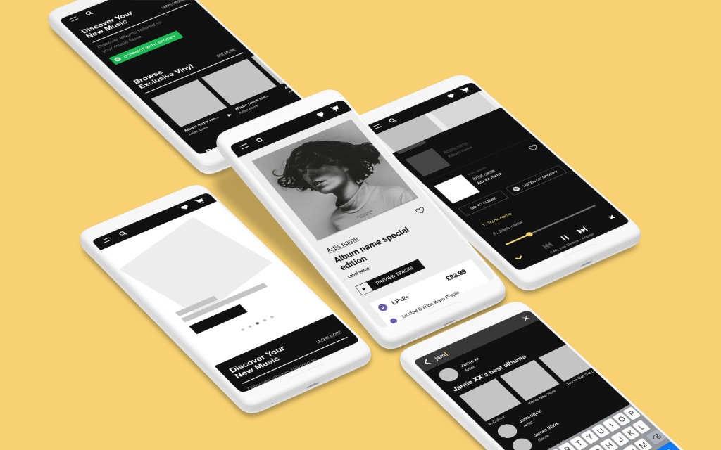
Independent Music Retailer
An indie-music legend — e-commerce redesign
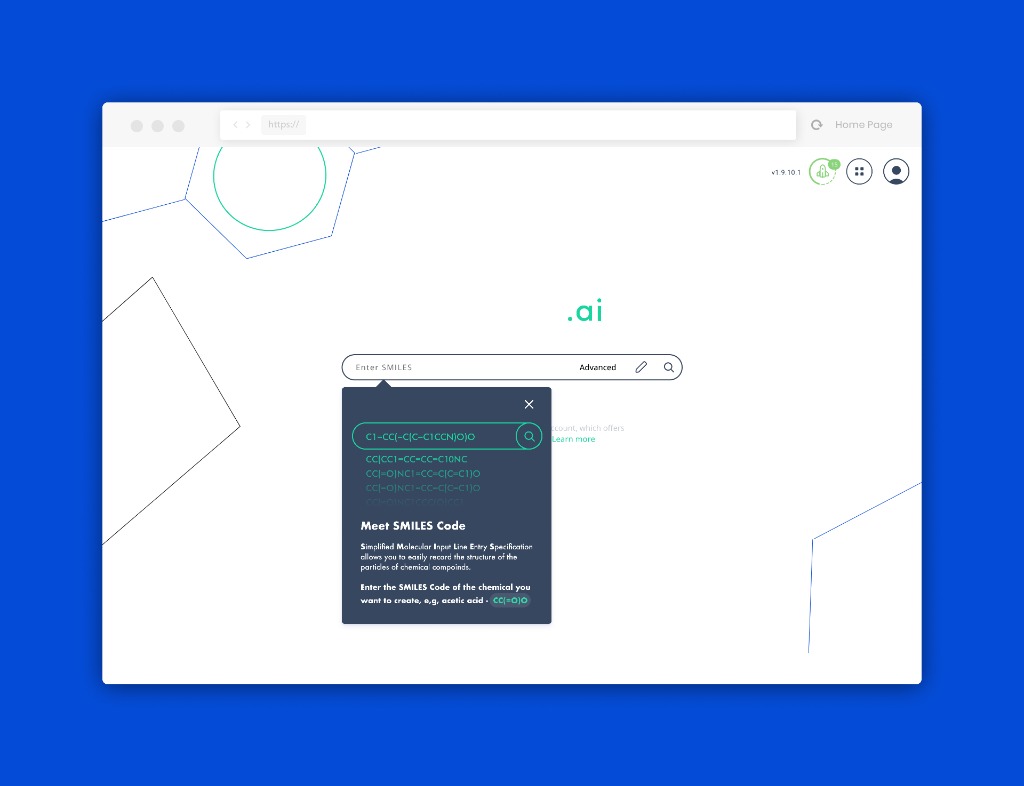
AI for the chemical industry
A SaaS platform supporting chemical retrosynthesis planning.
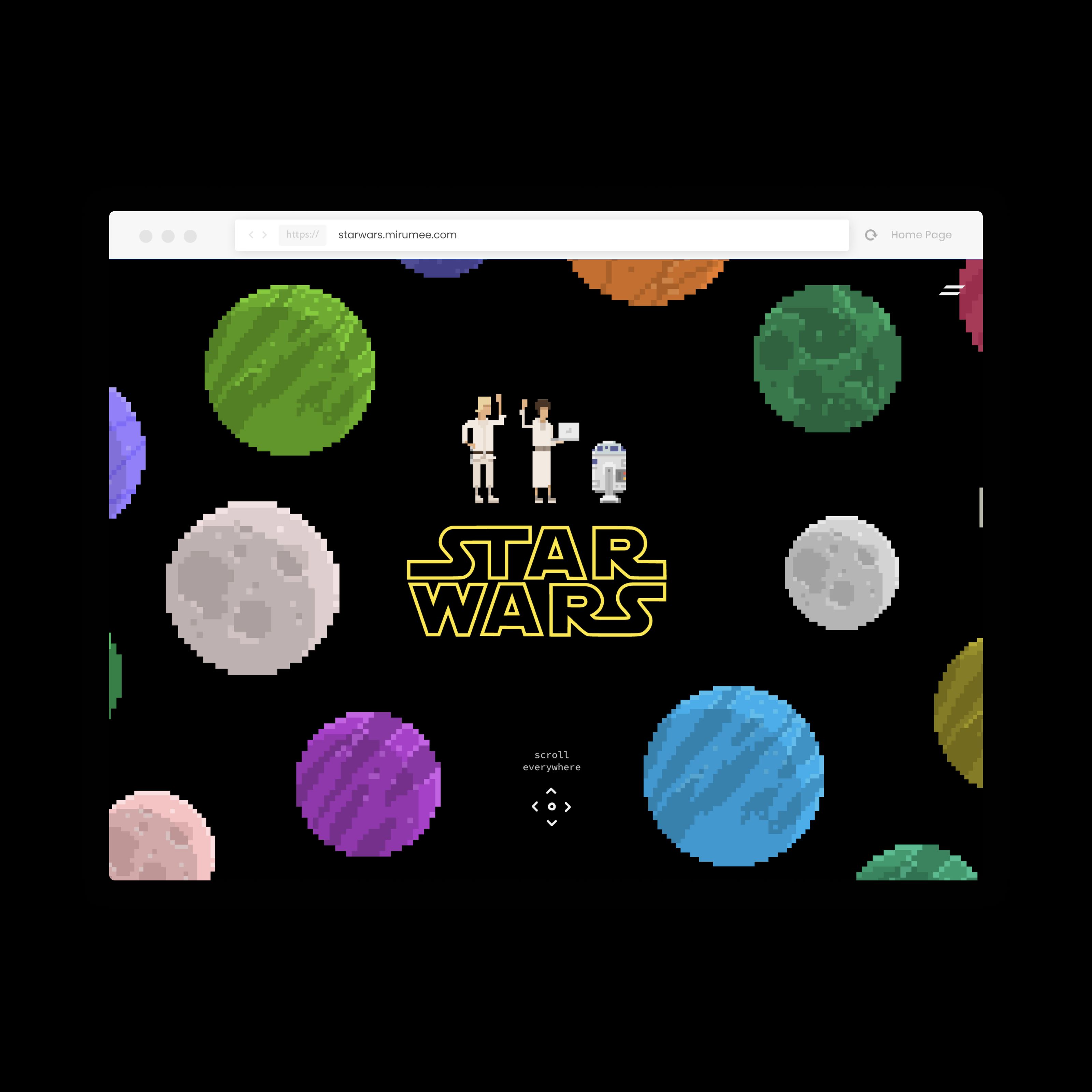
An inspiration-driven design system
A front-end recruitment task set in a sci-fi world.
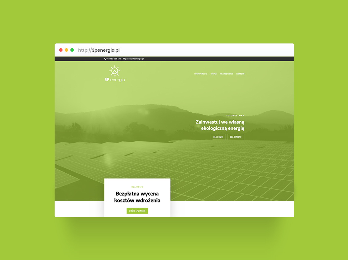
3P Energia
Comprehensive photovoltaic solutions for homes and businesses
.jpeg)
Meble Jurek
Furniture manufacturer with 25 years of experience
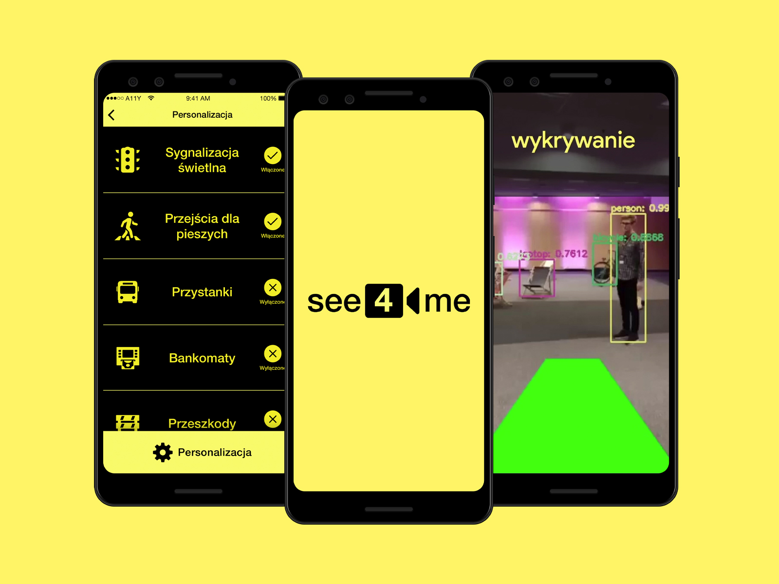
see4me
AR navigation helping blind people (Hackathon+)
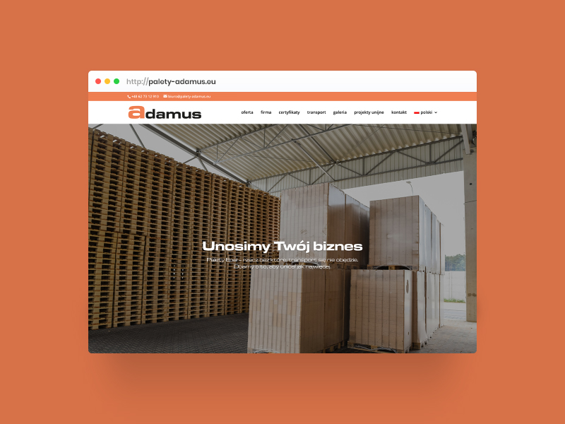
Adamus
EPAL pallet manufacturer with 30 years of experience
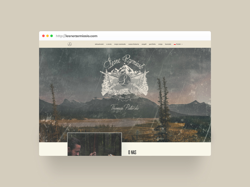
Leśne Rzemiosło
Website for a bushcraft project from Canada
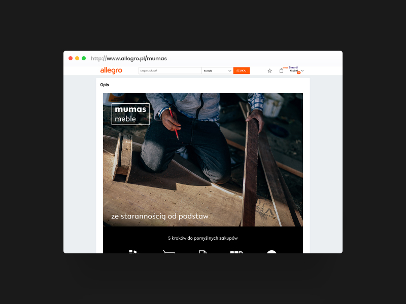
mumas
Logo and Allegro template for an online furniture store
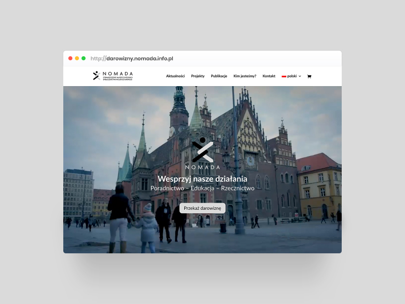
Nomada
Fundraising website for a human-rights association
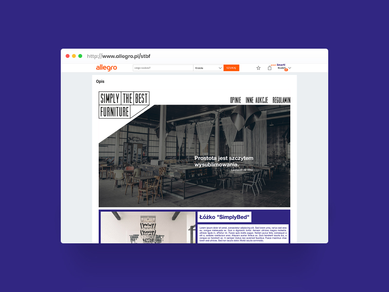
STBF
Visual identity for a furniture brand
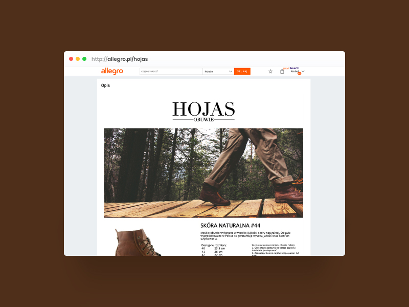
Hojas obuwie
Visual identity for a two-generation footwear business
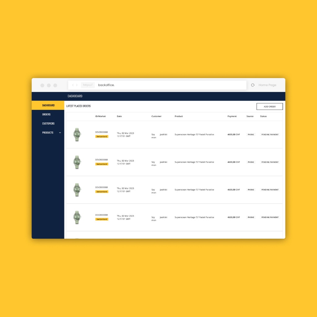
Luxury Watch E-Commerce
dashboard and mechanisms
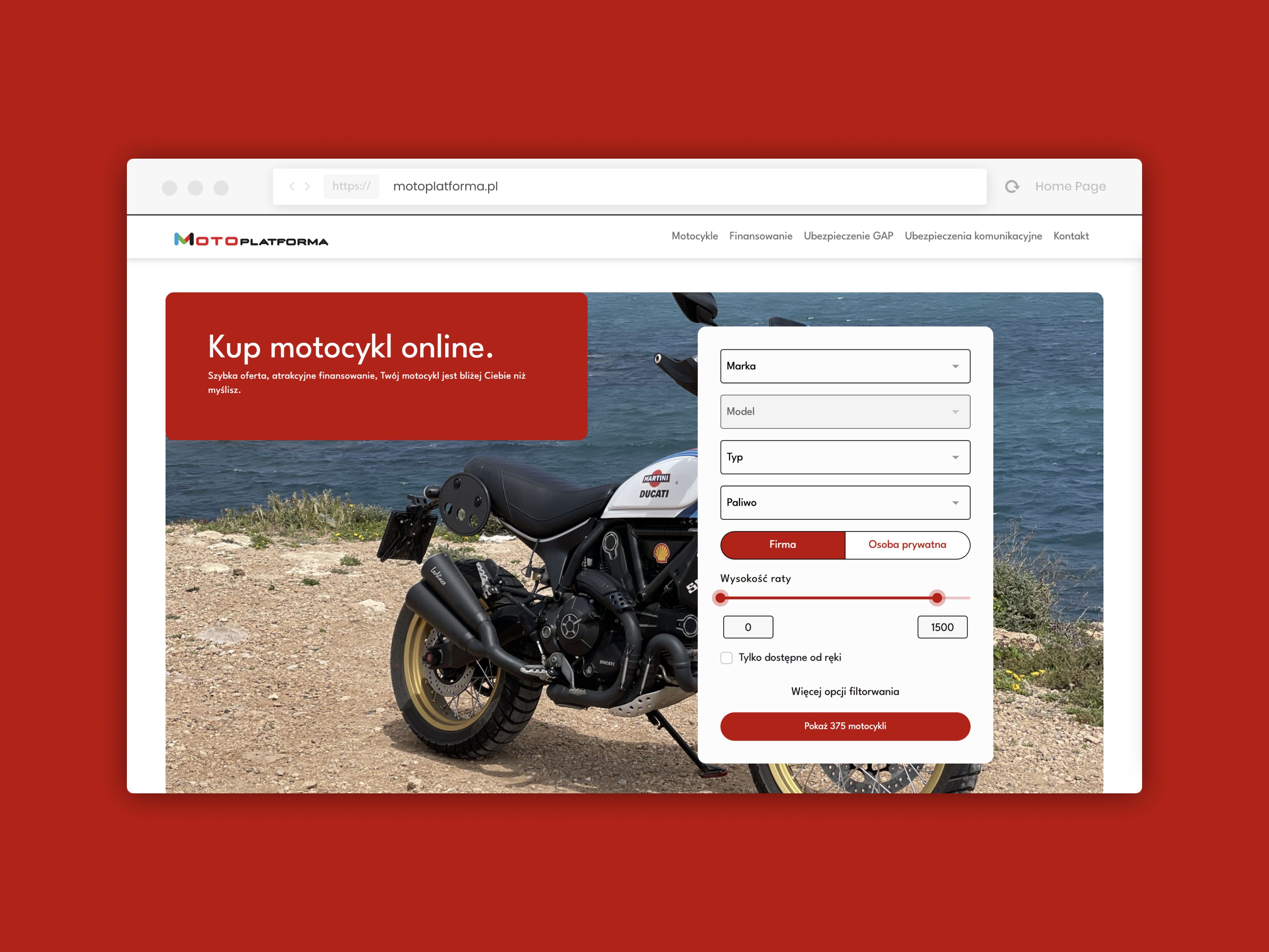
Motoplatforma
Multi-brand motorcycle showroom and online financing system
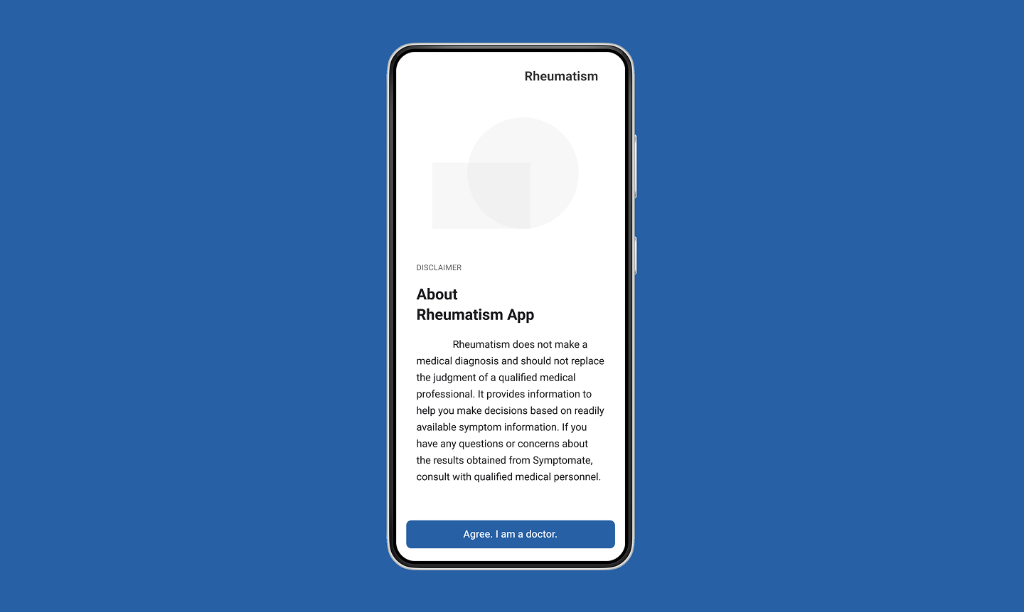
Global Pharma Ecosystem
A set of 3 med-tech apps — protected access
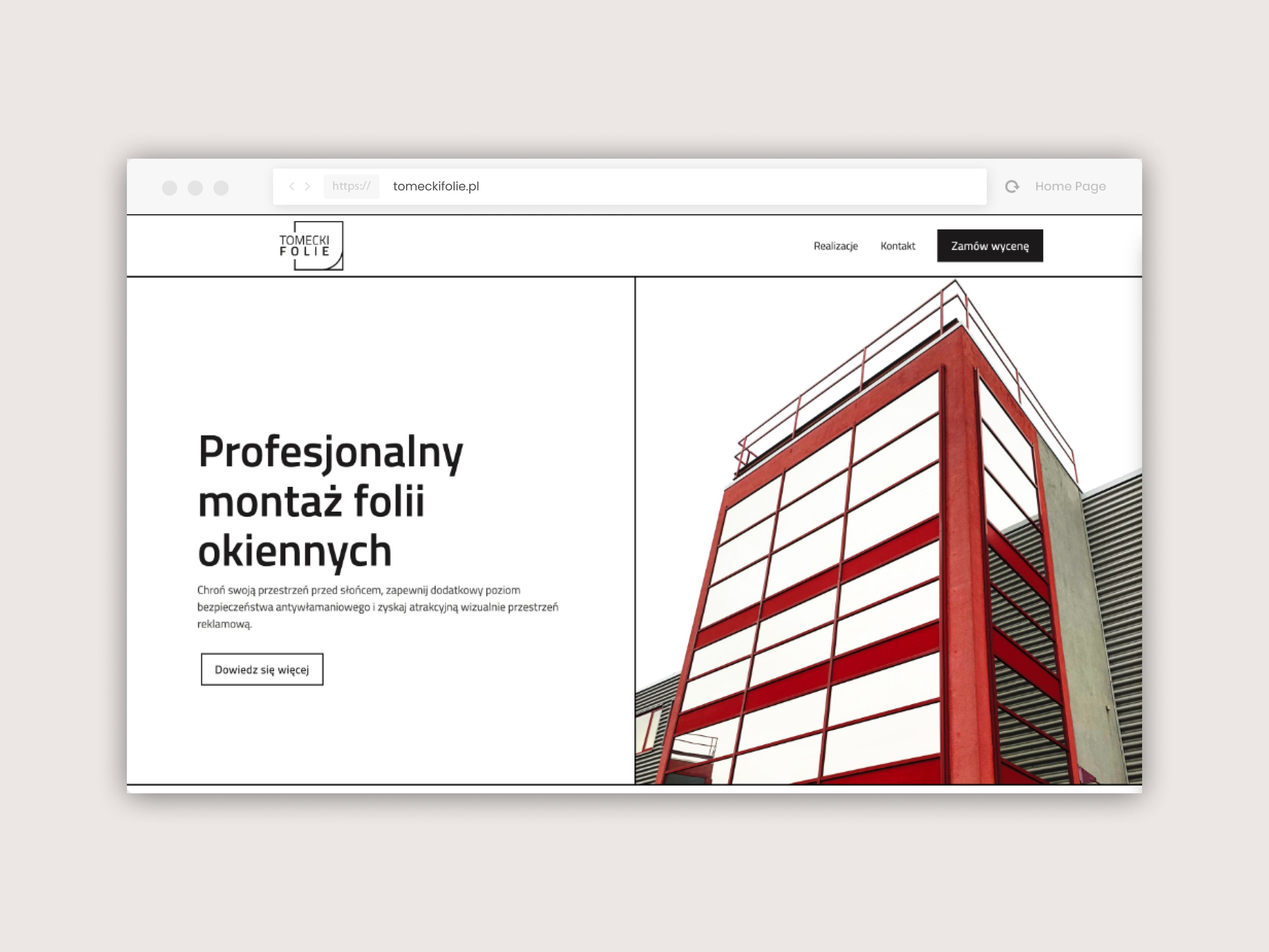
Tomecki Folie
Brand website and lead-gen ecosystem built in Webflow
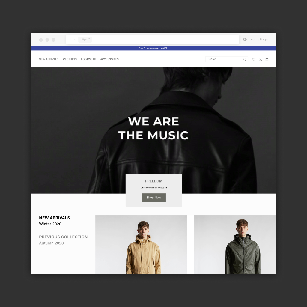
British Fashion E-Commerce
Premium brand homepage — access after LinkedIn verification
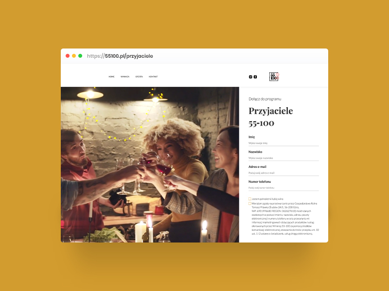
Przyjaciele 55-100
Digital loyalty program for a microclimate vineyard
Meblify
Rebranding a Polish online store for Allegro × D2C
Open-source E-Commerce Ecosystem
Installer, swag store and recruitment platform
WORKITNOW
Brand website with a recruitment system for an IT company