zandberg2025.pl
Adrian Zandberg's presidential campaign
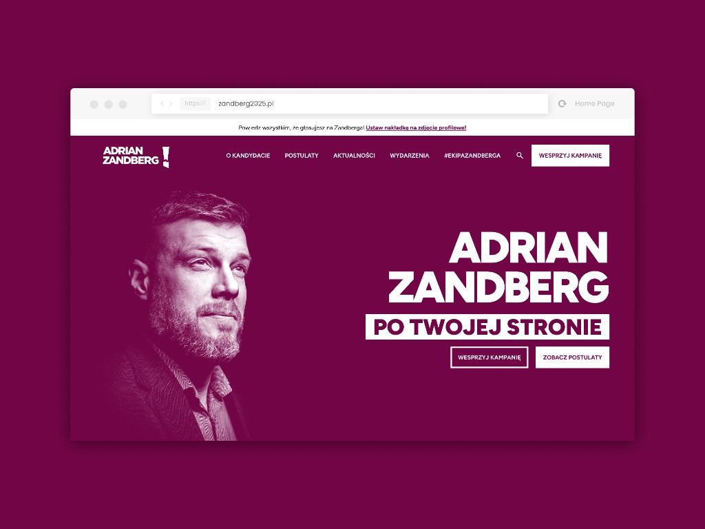
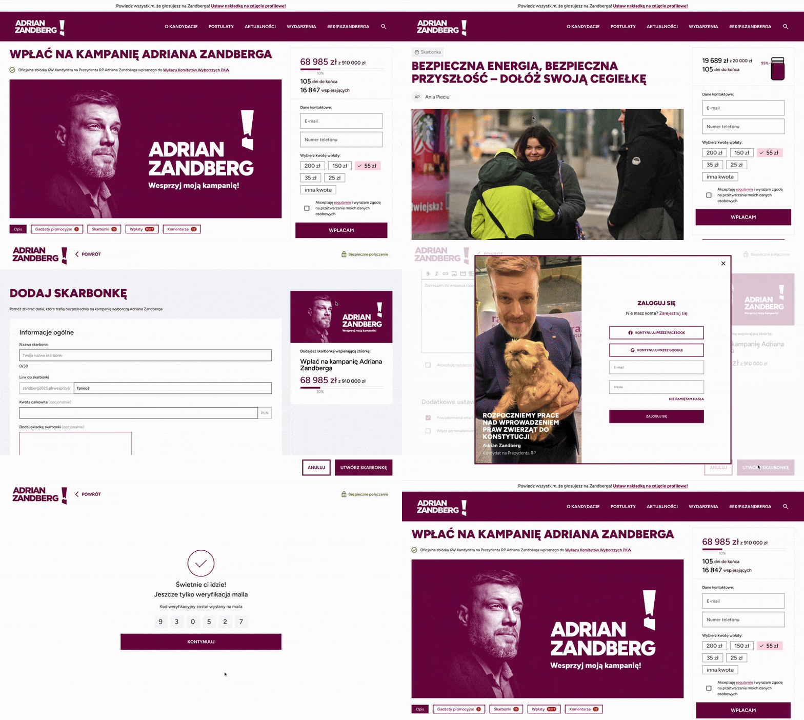
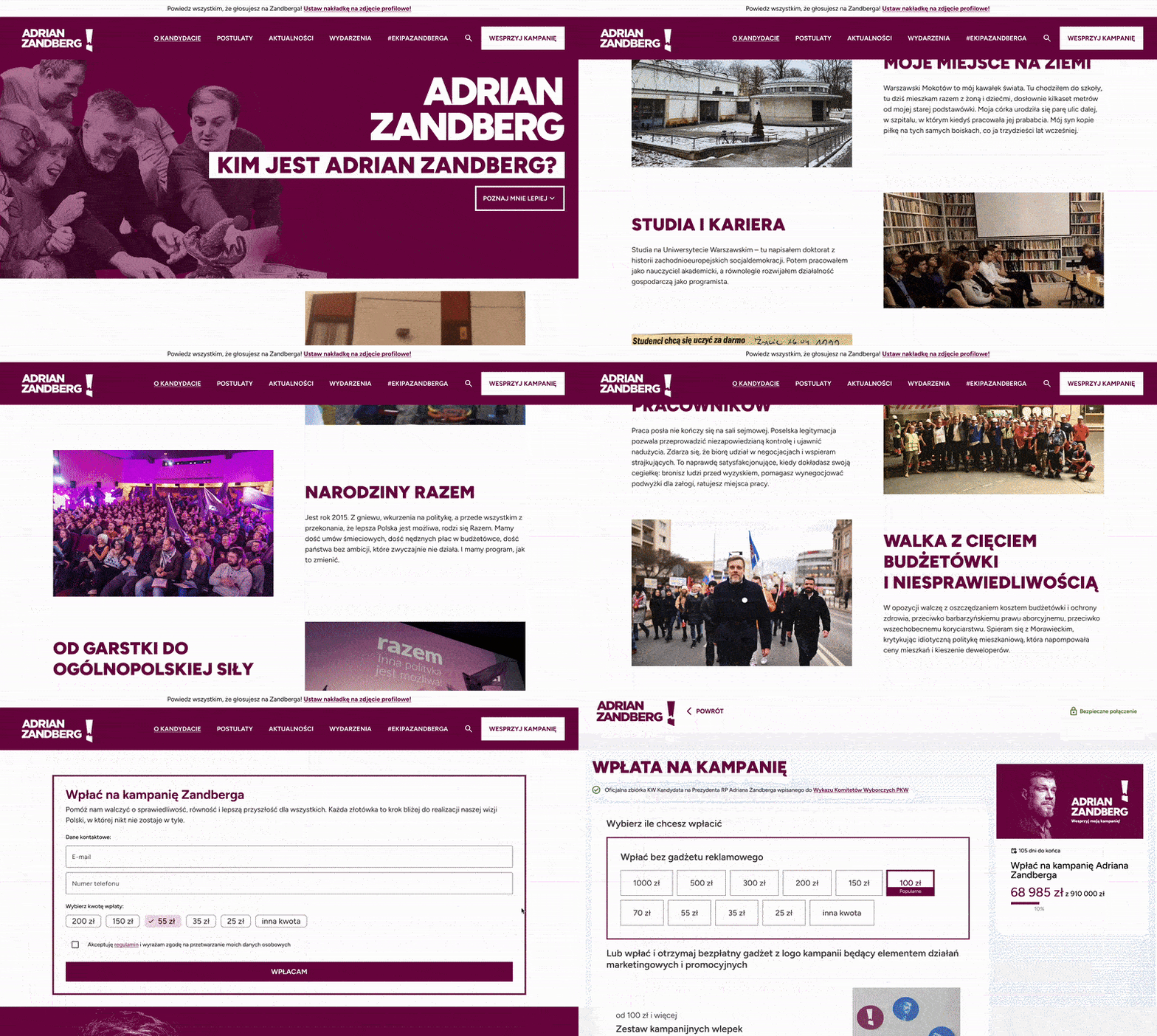
The challenge was to design an extensive campaign portal for Adrian Zandberg whose goal was not only to present the candidate and his program, but above all to mobilize the widest possible audience. The result was a coherent portal structure including an "About the candidate" page with a bio, an interactive "Proposals" section letting users endorse specific points and then guiding them toward donation conversions. I also designed a profile-picture overlay generator, a downloads area, an events map with sign-ups, a signature-collection module, a volunteer registration form, a donation-reward system, a "collection jars" system with a live donation counter, a support counter, an exit-intent popup and a transparent register of donations.
Homepage & visual identity
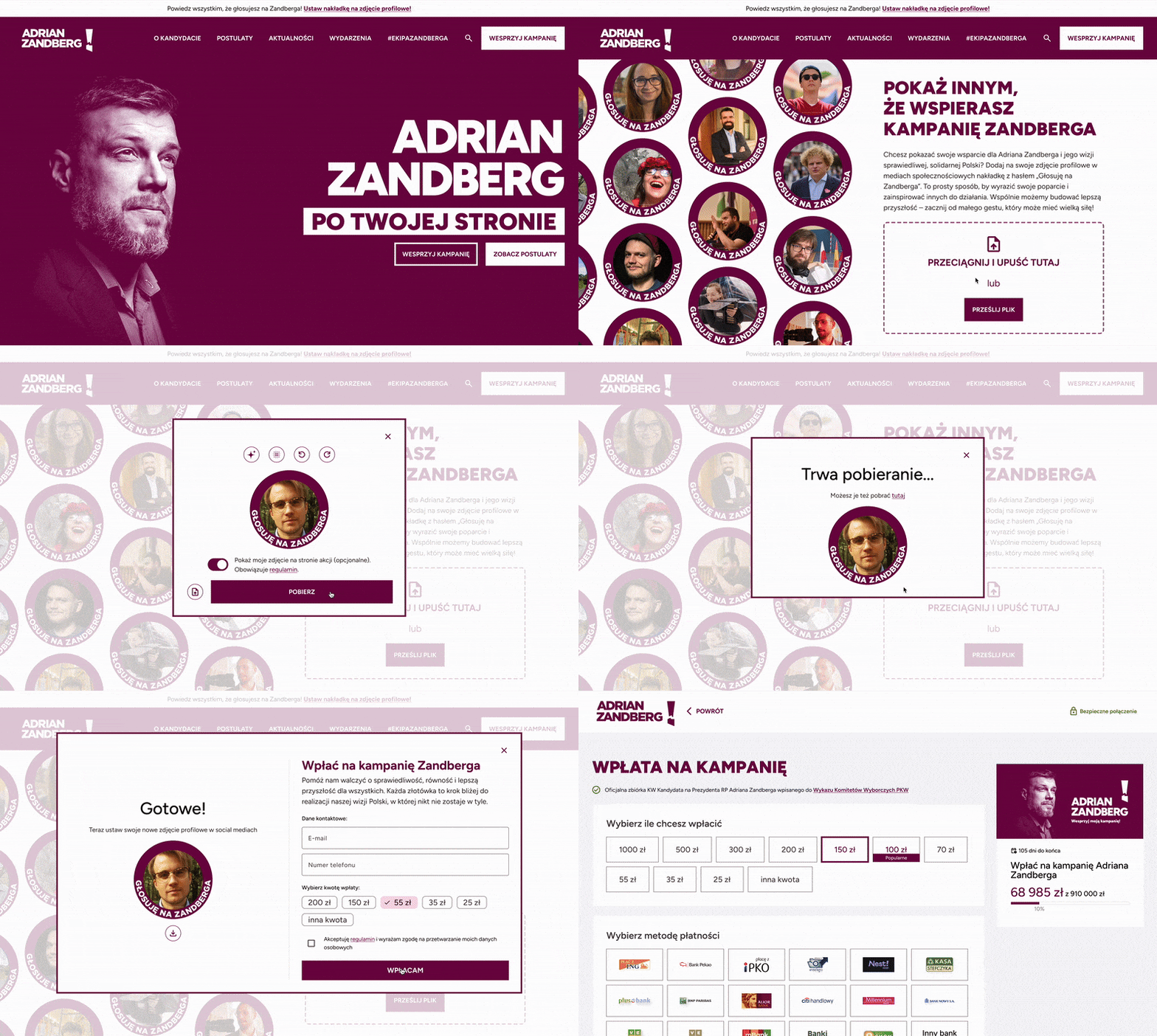
Zandberg2025.pl served as the official hub of the presidential campaign. The homepage presented Adrian Zandberg as a candidate on your side — drawing attention with a strong slogan, a portrait of the candidate and a clear call to action. The visual identity was built on bold typography, a contrasting deep raspberry red and a simple, legible grid.
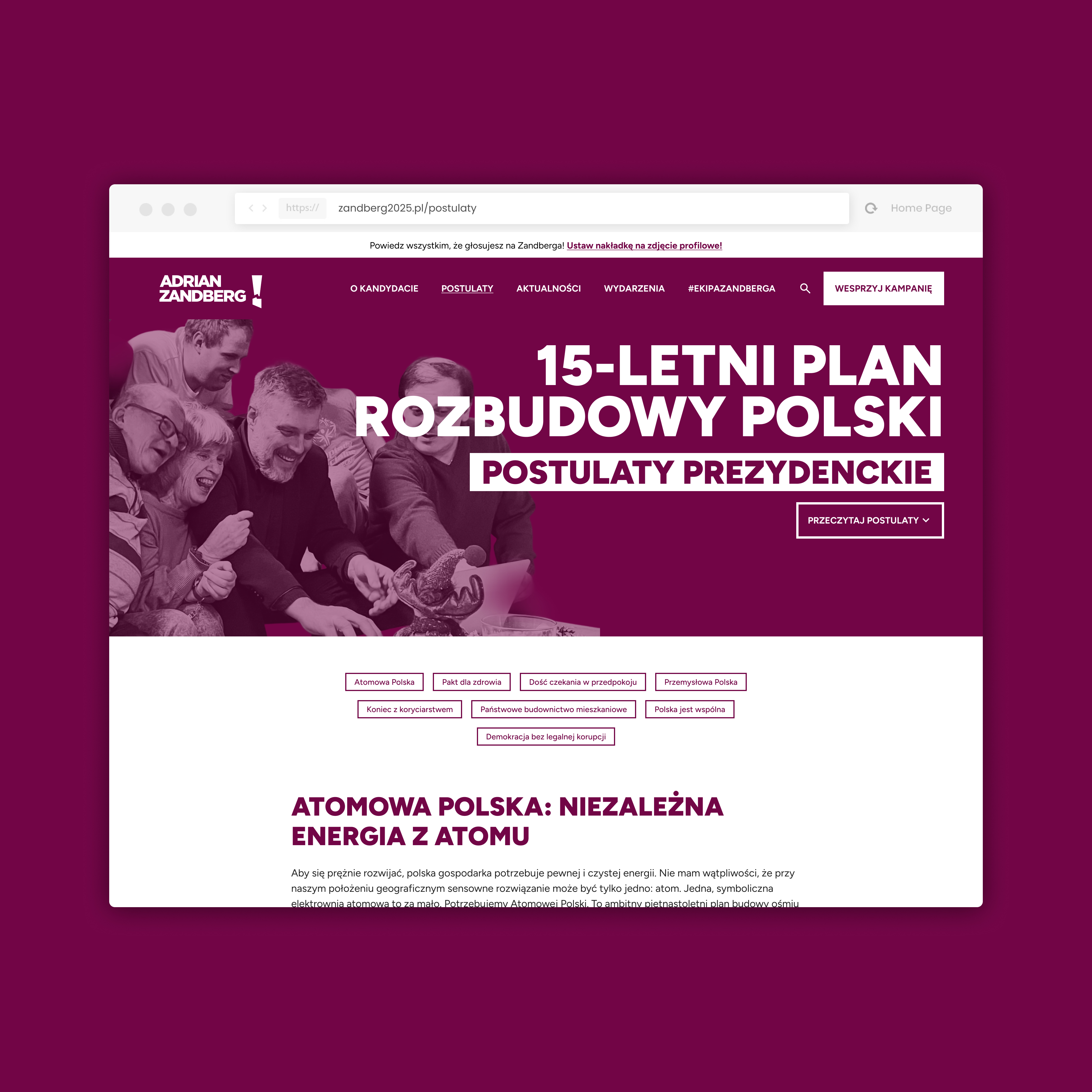
Proposals — a 15-year plan to expand Poland
The site let users dive into Zandberg's program: a 15-year plan to build eight nuclear units, raise health spending to 8% of GDP and develop state housing construction. Proposal-category tabs (Nuclear Poland, A Pact for Health, State Housing) allowed quick navigation across the whole program.
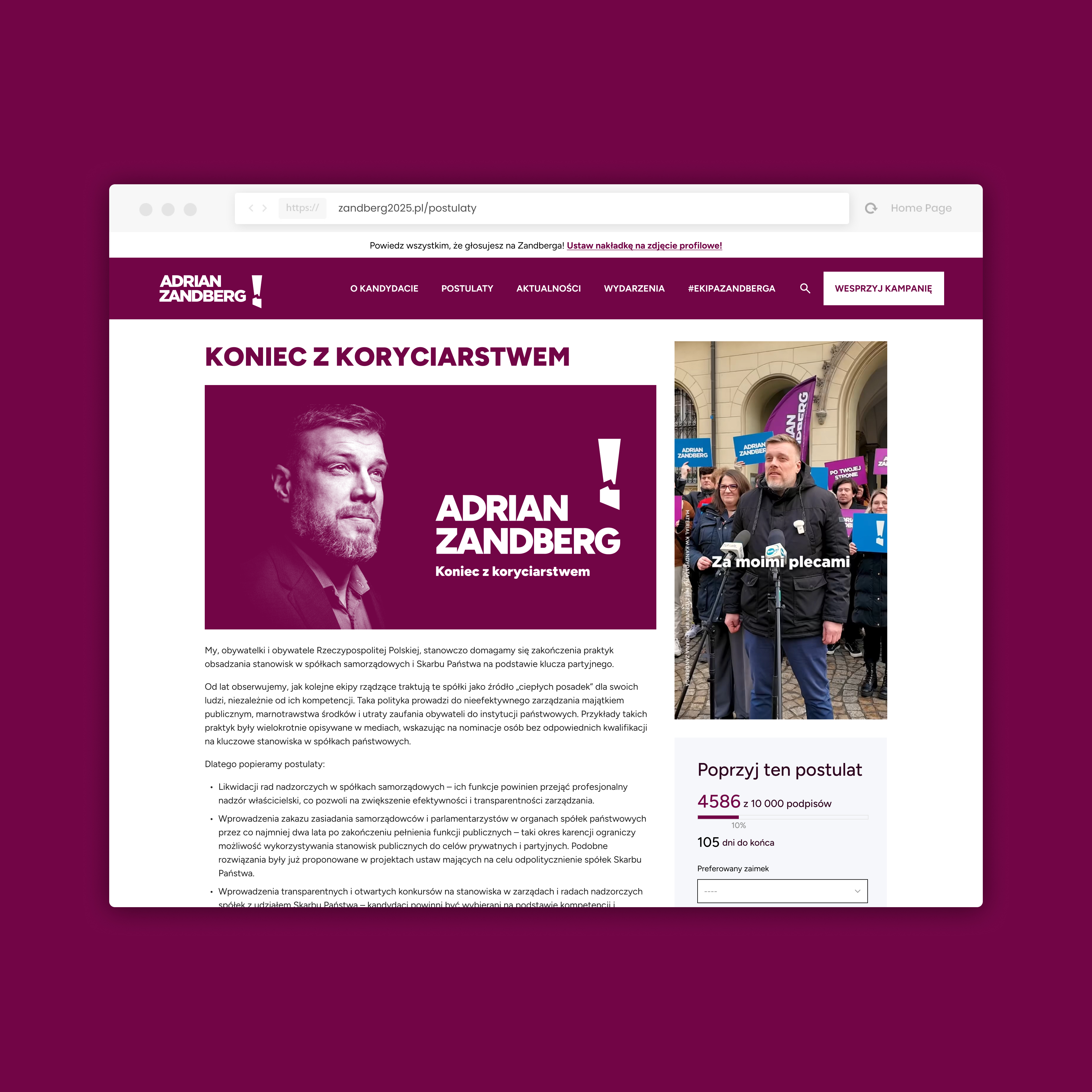
An end to patronage — personalized proposals
Each proposal was presented as a separate, dedicated page with rich content, a visual of the candidate and an interactive endorsement form. This let users actively express support for specific program points, building engagement and a community around the campaign.
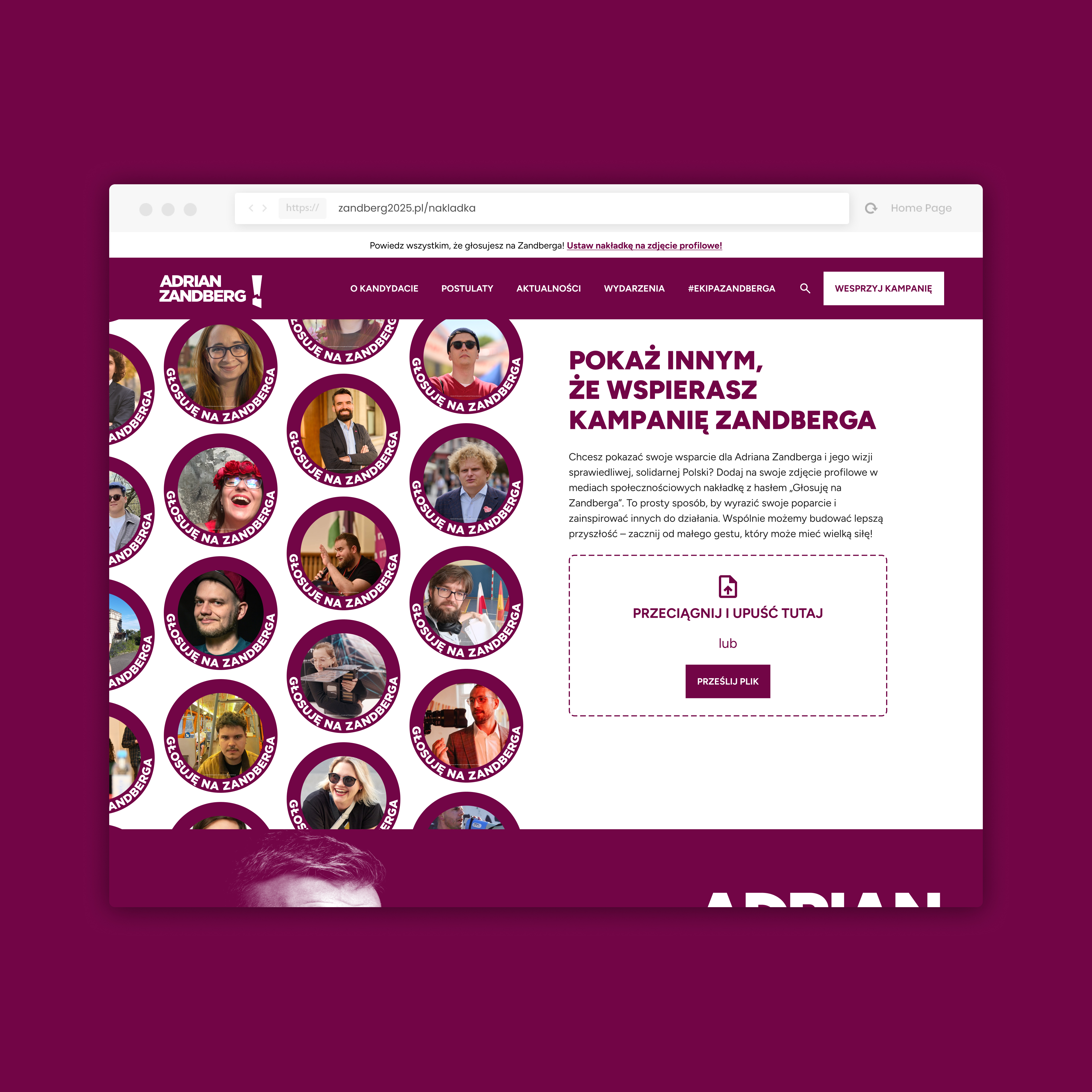
#EKIPAZANDBERGA — profile-picture overlay
A profile-picture overlay tool encouraged users to publicly declare support on social media. The site generated personalized photos with the slogan 'I'm voting for Zandberg' that could be shared directly to Facebook or X — a simple but effective viral-marketing mechanism.
Support the campaign — donation system
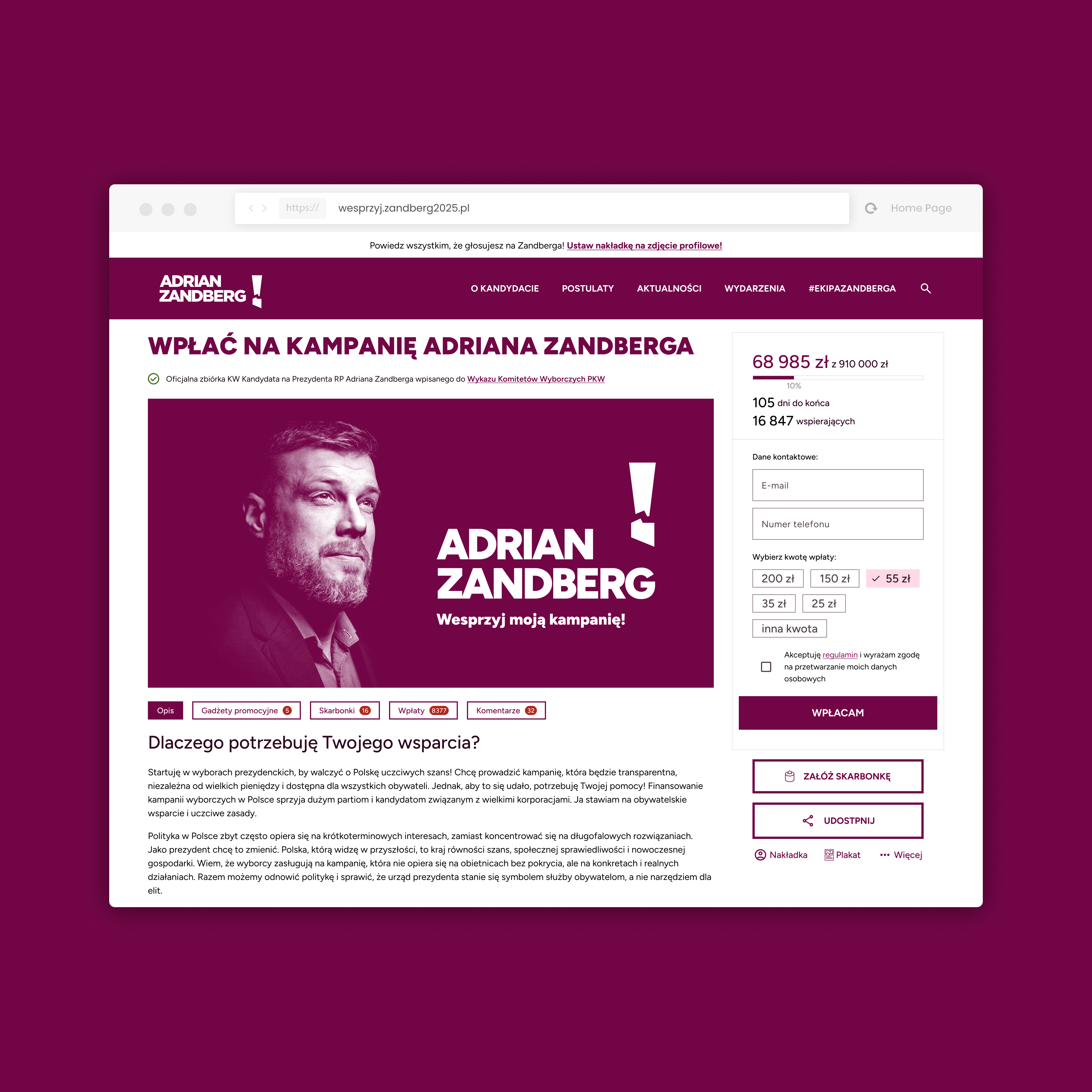
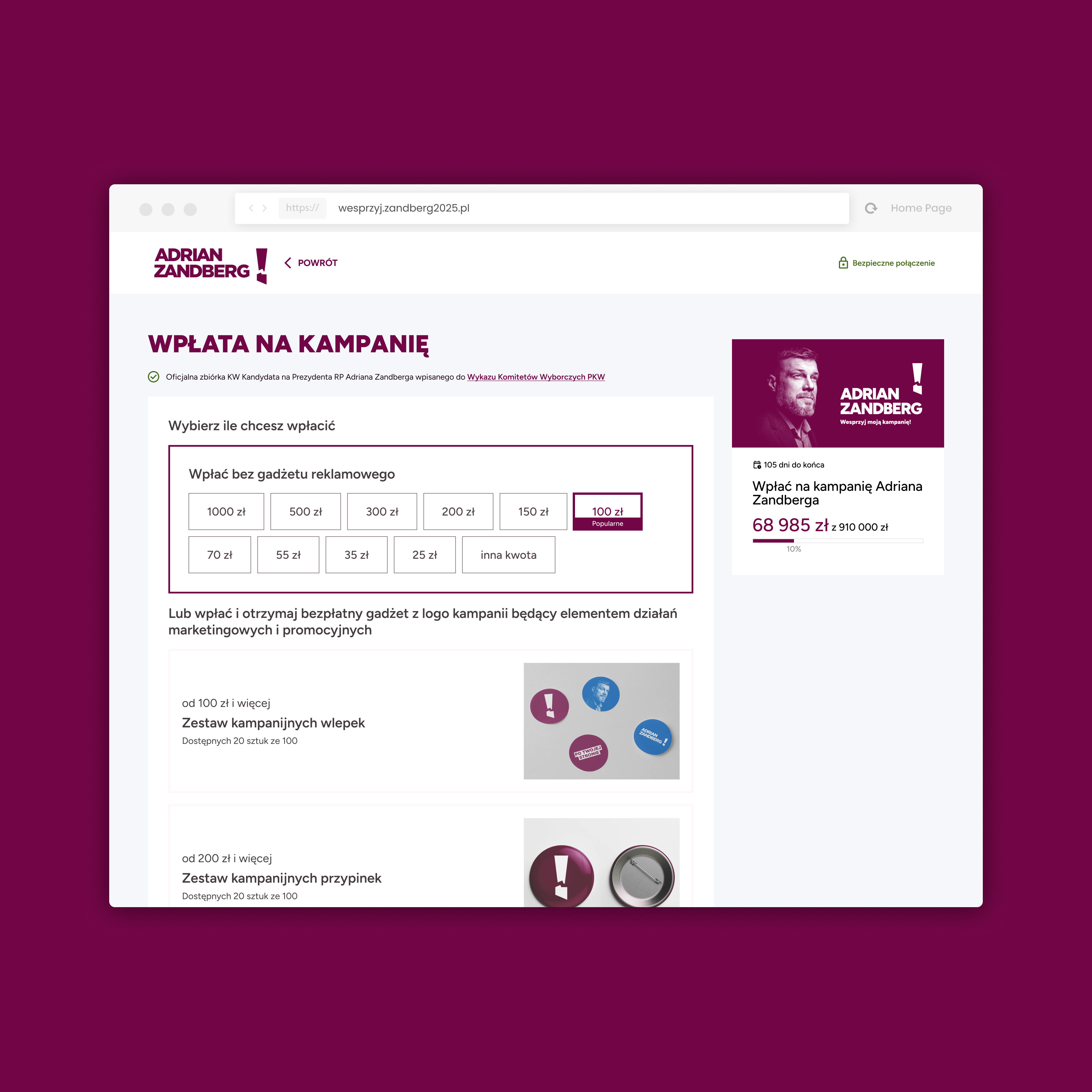
Zandberg's campaign emphasized financial independence, relying solely on voluntary citizen donations. The support page was clear and intuitive — with amount selection, a quick redirect to payment and real-time counters of funds raised.
Collection jars — community fundraising
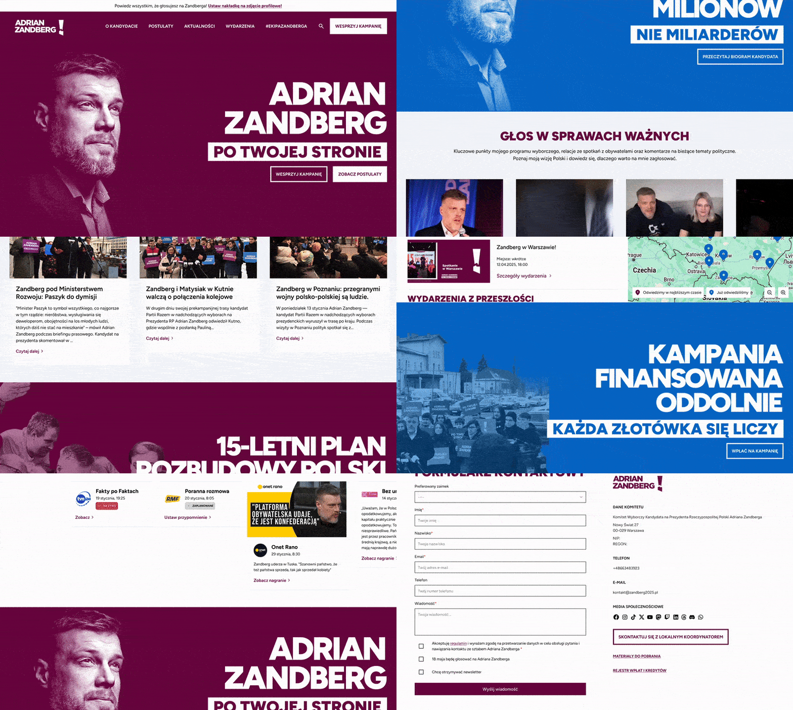
An innovative feature was the collection jars — individual fundraisers run by volunteers. Any supporter could create their own jar, share its link and raise money for the campaign within their network. The system was built directly into the site with full result tracking.
Recent donations — funding transparency
In the spirit of campaign transparency, the site showed a real-time list of recent donations — with each donor's first name, city and amount (with their consent). This built trust and motivated more visitors to join the supporters.
.gif)
Ordering campaign materials
Volunteers could order campaign materials directly through the site — posters, flyers and banners — delivered to their address. The ordering system was simple, integrated with the campaign's logistics and allowed order-status tracking.
.gif)
Events map & volunteering
An interactive map of all campaign events across Poland let supporters find the nearest meeting, rally or flyering action. An integrated volunteer-registration form made joining a local team instant.
Collecting signatures for proposals
Each program proposal had its own signature counter and endorsement form. Users could sign specific plans, serving as a mobilization tool and building a base of potential voters around the issues they care about.
.gif)
Campaign merchandise — on-site shop
A campaign-merchandise shop (t-shirts, mugs, bags) was integrated directly into the site. Every purchase was also a form of financial support — products were designed consistently with the visual identity and instantly recognizable.
Exit Intent — a last chance to engage
A smart exit-intent popup appeared to users leaving the site without taking any action, offering a choice: donate, join the team or download materials. The personalized message increased conversion and minimized lost visits.
May 18 — election-day mobilization
On the day of the first round (May 18), the site switched to mobilization mode — showing a countdown, polling-station maps and a simple social-media share generator. The goal was to maximize supporters' turnout.
Judge 3.0
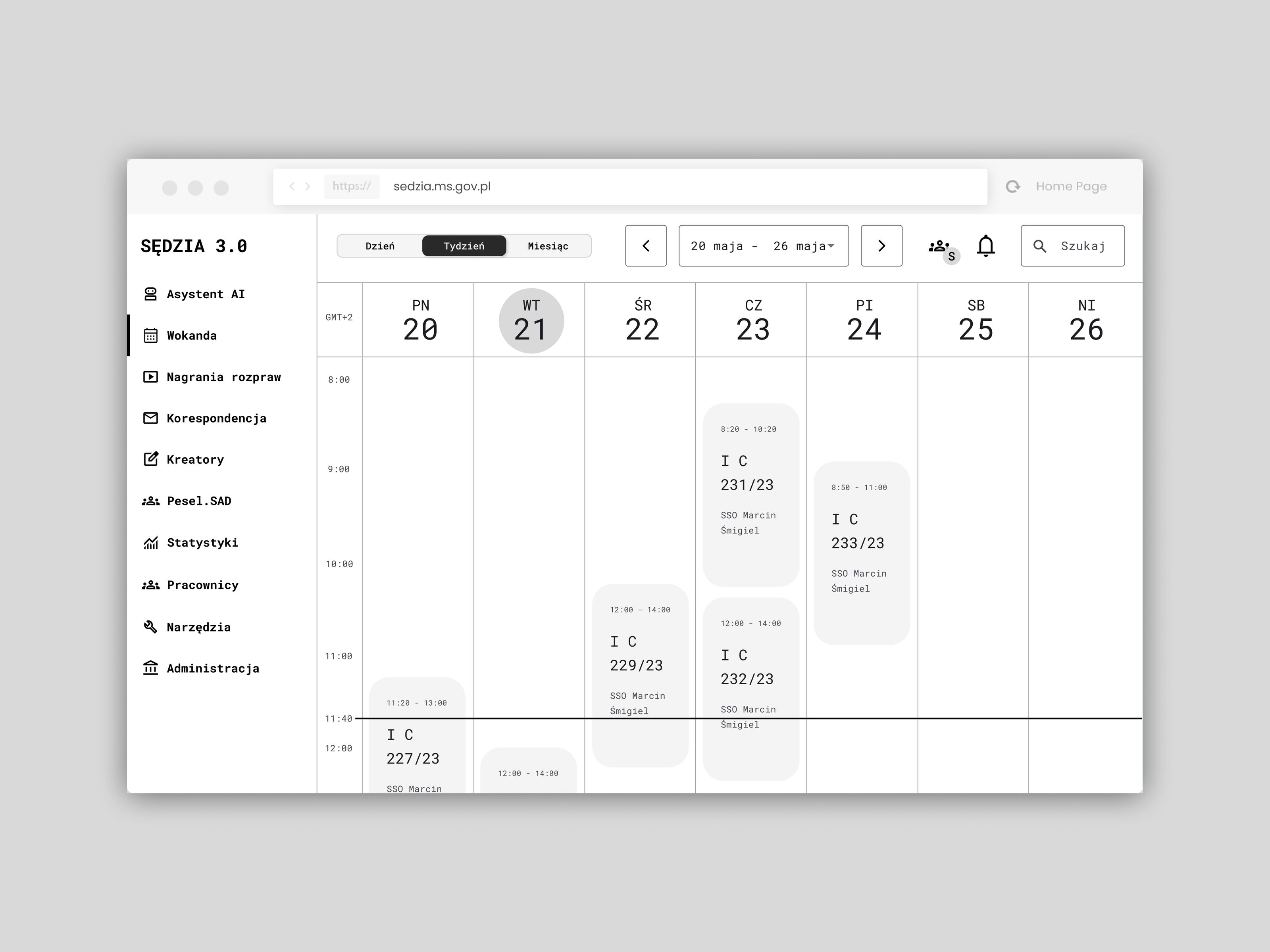
Modernizing the IT systems of Poland's common courts — a concept for the Ministry of Justice
SaaS panel for a self-publishing platform
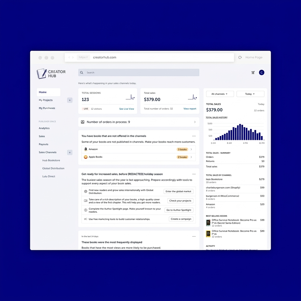
Redesign of a comprehensive content- and sales-management panel for creators.
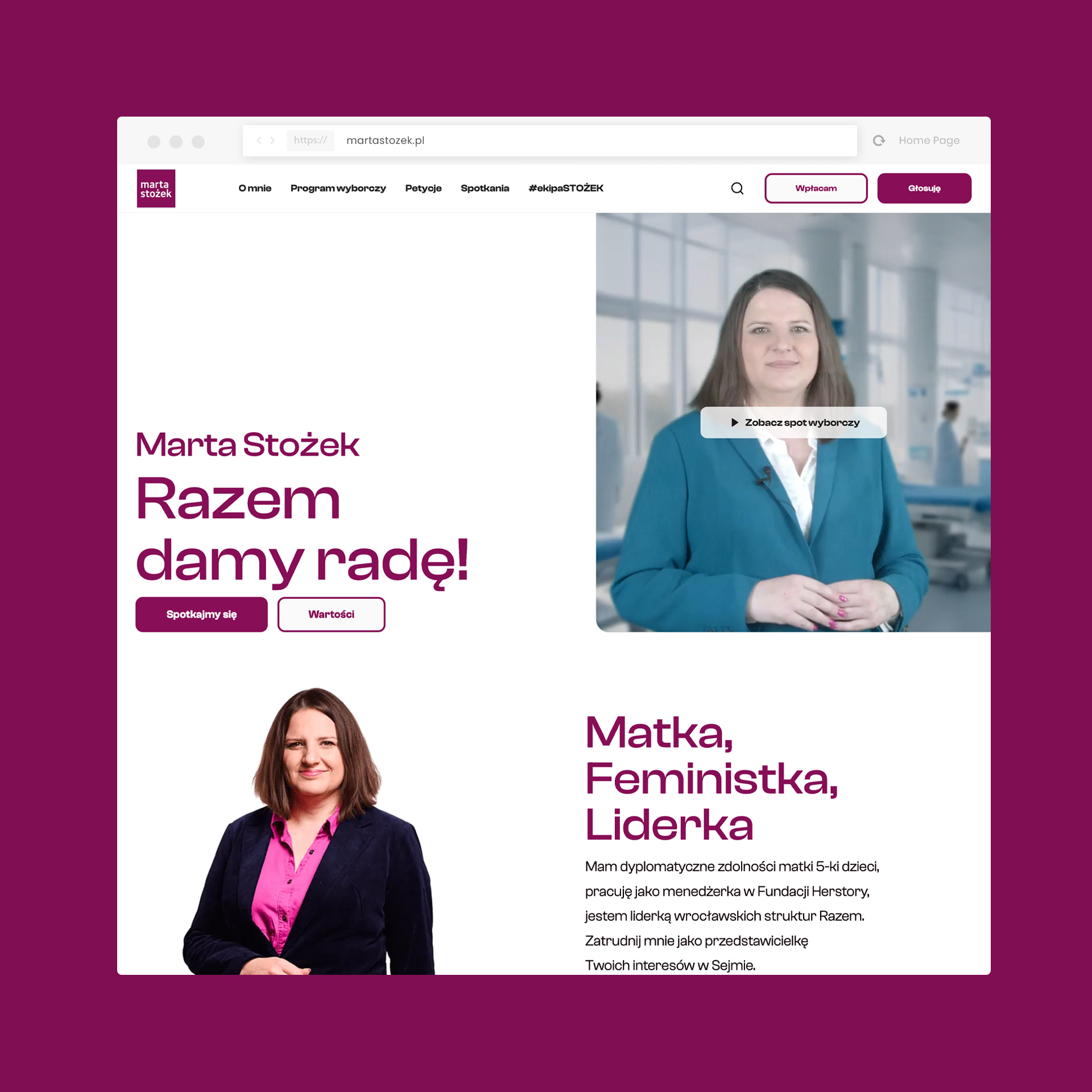
Marta Stożek
Election campaign: from strategy to execution
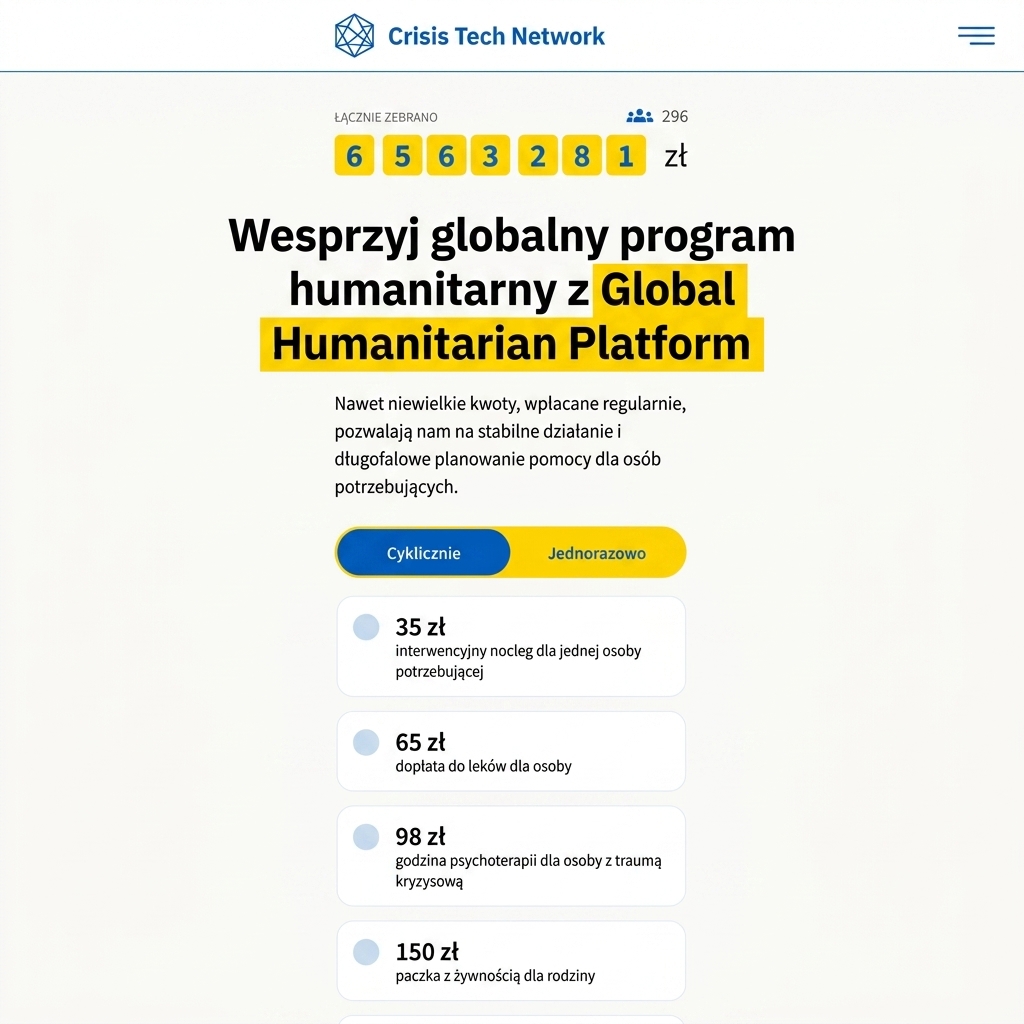
Global Humanitarian Platform
An NGO support project
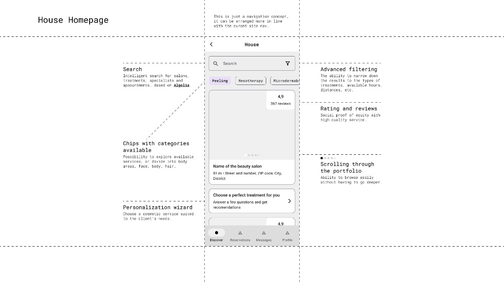
Global Beauty Brand
Salon-service UX concept — protected access
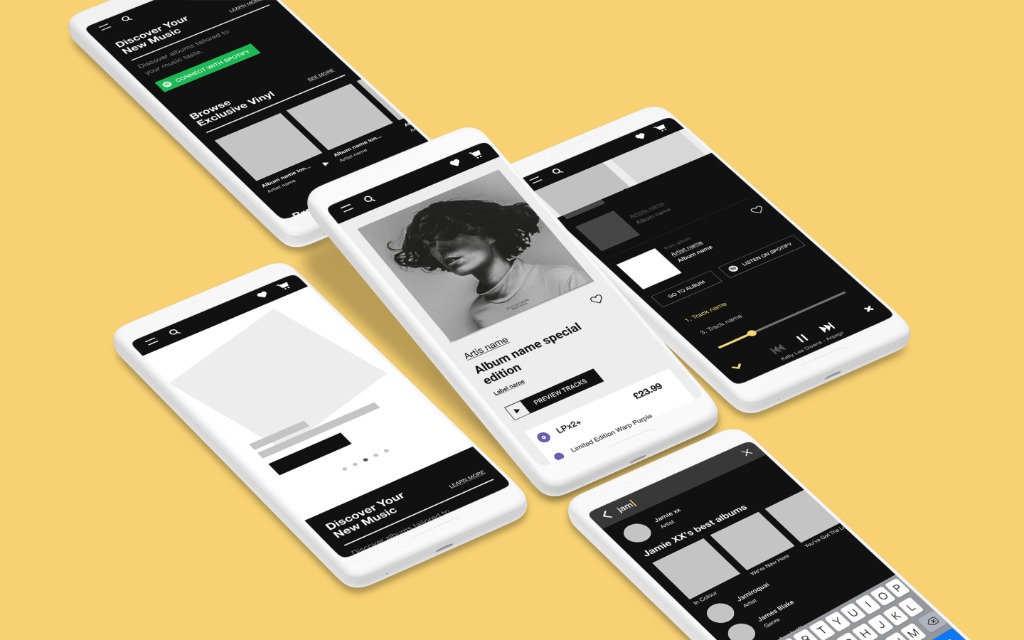
Independent Music Retailer
An indie-music legend — e-commerce redesign
AI for the chemical industry
A SaaS platform supporting chemical retrosynthesis planning.
An inspiration-driven design system
A front-end recruitment task set in a sci-fi world.
3P Energia
Comprehensive photovoltaic solutions for homes and businesses
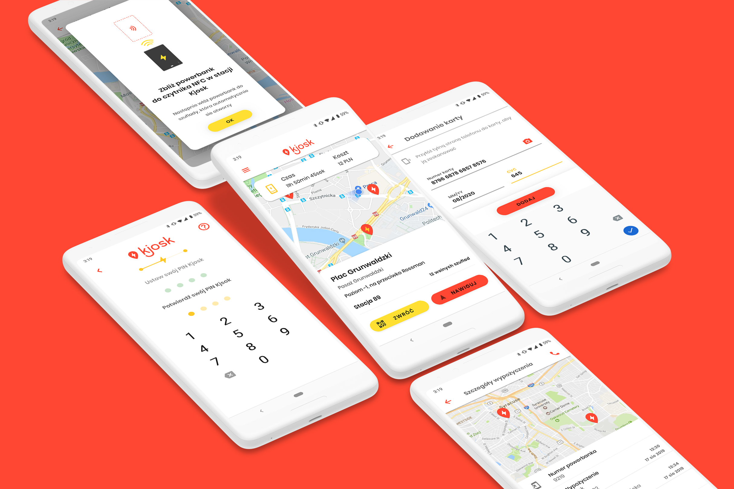
Kjosk
UX/UI Design: a power-bank rental app
.jpeg)
Meble Jurek
Furniture manufacturer with 25 years of experience
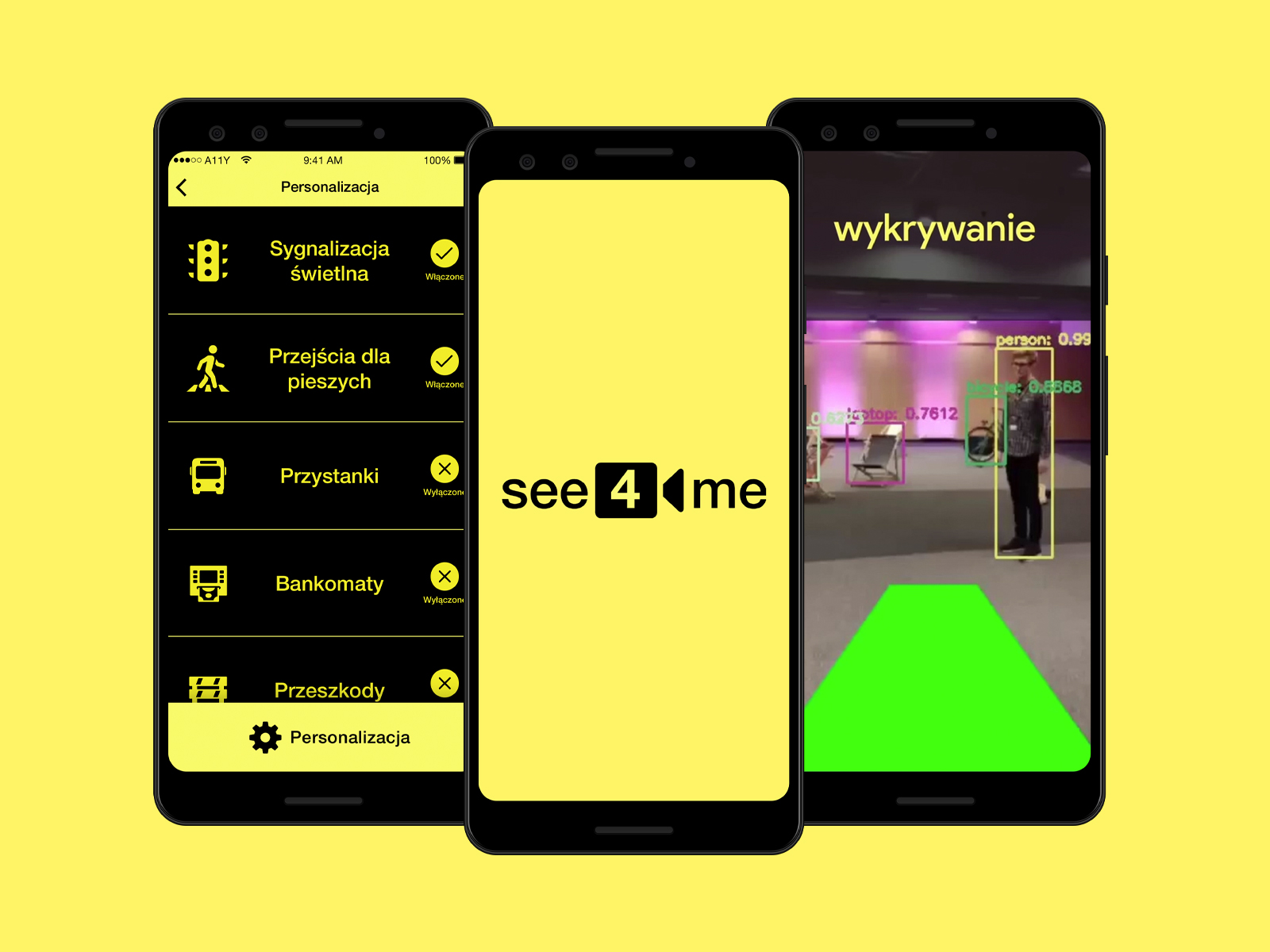
see4me
AR navigation helping blind people (Hackathon+)
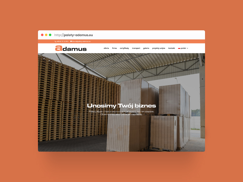
Adamus
EPAL pallet manufacturer with 30 years of experience
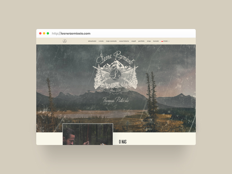
Leśne Rzemiosło
Website for a bushcraft project from Canada
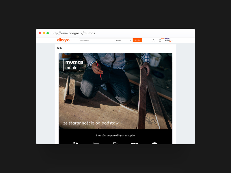
mumas
Logo and Allegro template for an online furniture store
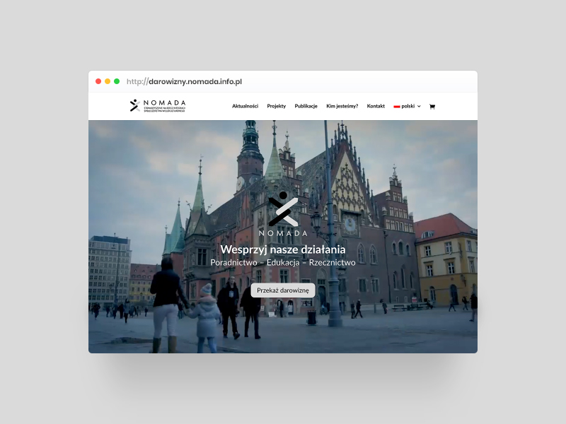
Nomada
Fundraising website for a human-rights association
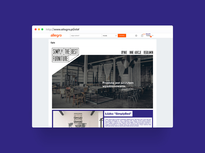
STBF
Visual identity for a furniture brand
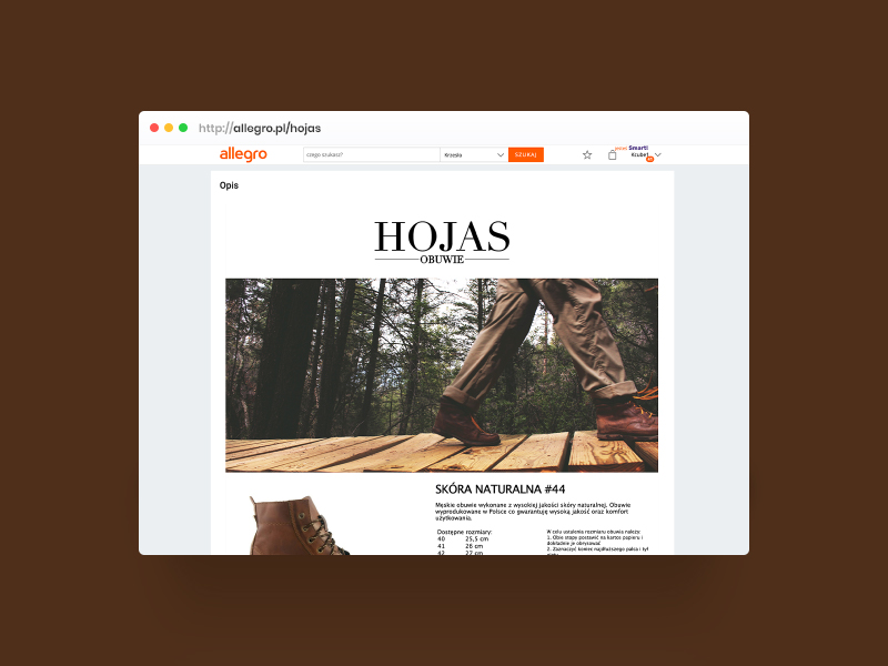
Hojas obuwie
Visual identity for a two-generation footwear business
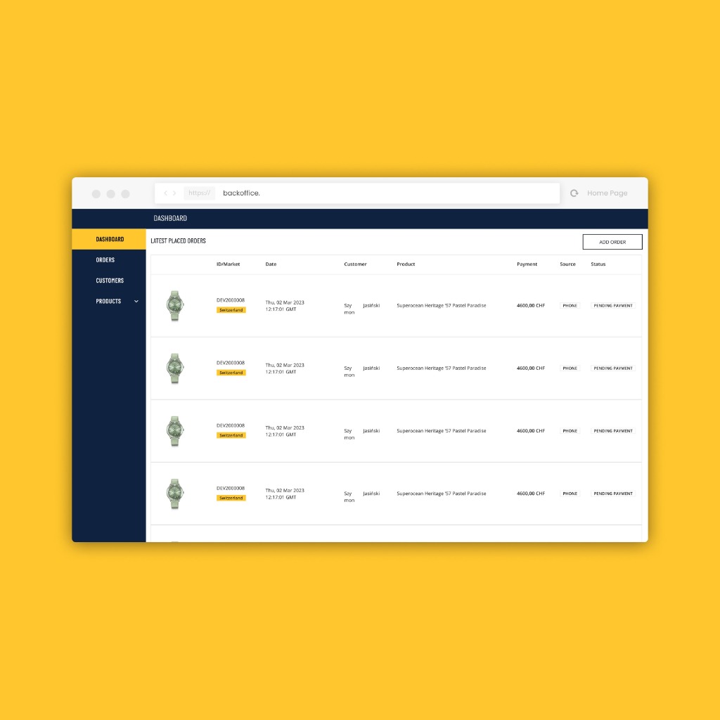
Luxury Watch E-Commerce
dashboard and mechanisms
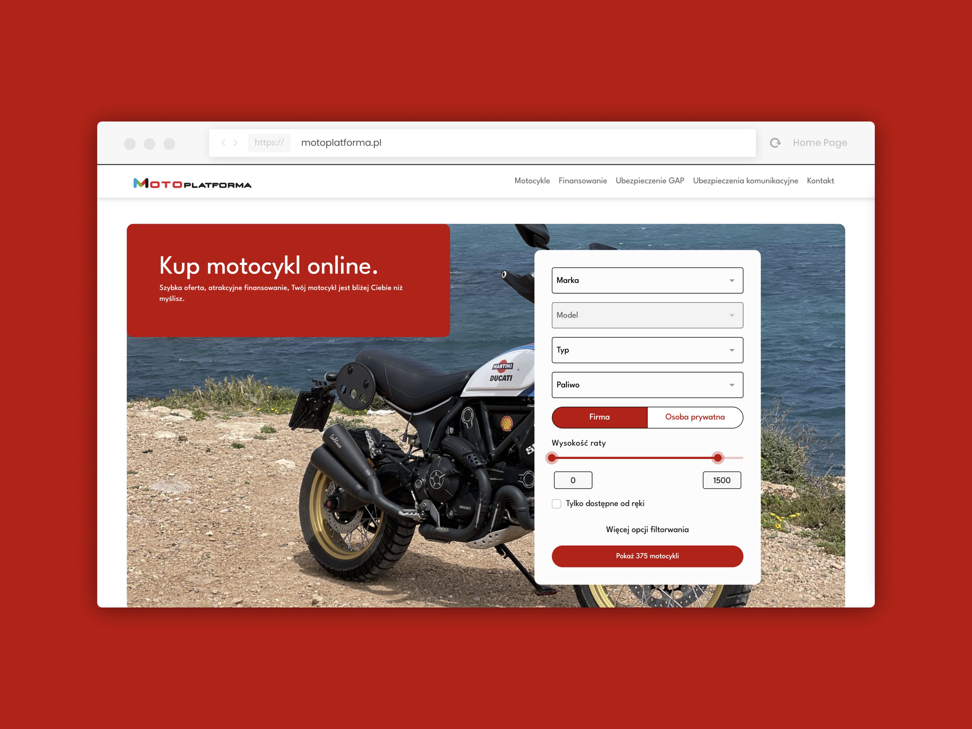
Motoplatforma
Multi-brand motorcycle showroom and online financing system
Global Pharma Ecosystem
A set of 3 med-tech apps — protected access
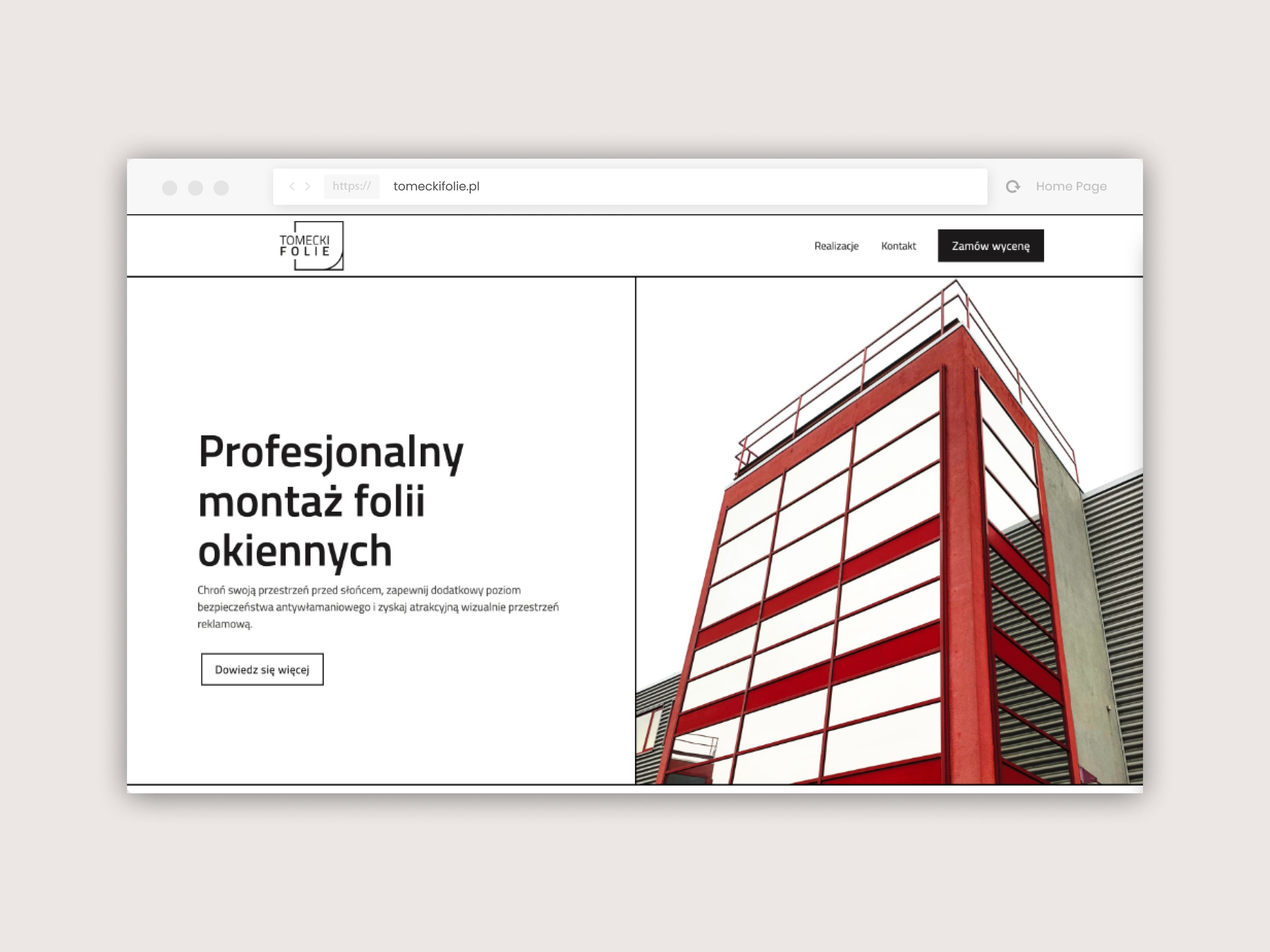
Tomecki Folie
Brand website and lead-gen ecosystem built in Webflow
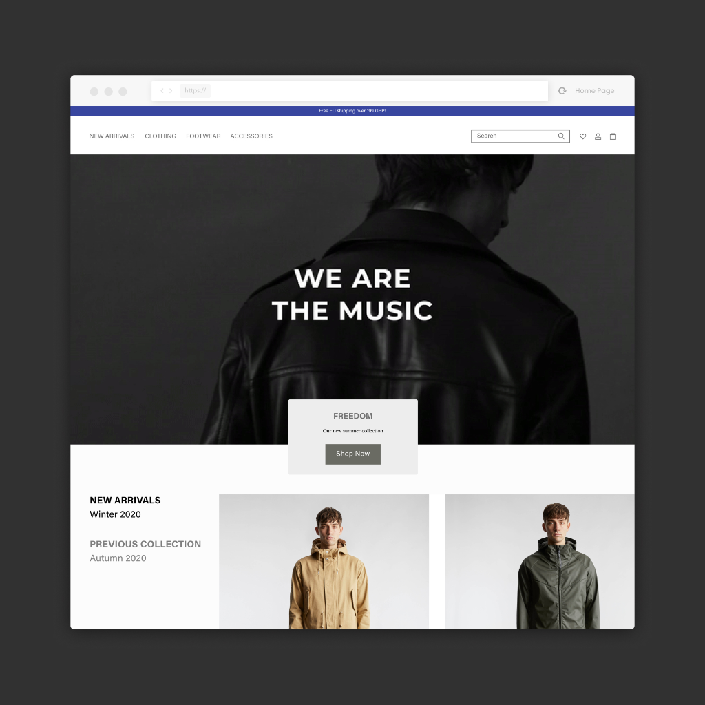
British Fashion E-Commerce
Premium brand homepage — access after LinkedIn verification
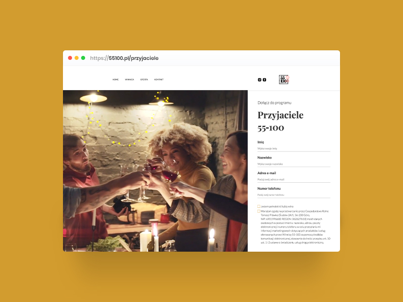
Przyjaciele 55-100
Digital loyalty program for a microclimate vineyard
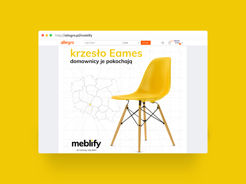
Meblify
Rebranding a Polish online store for Allegro × D2C
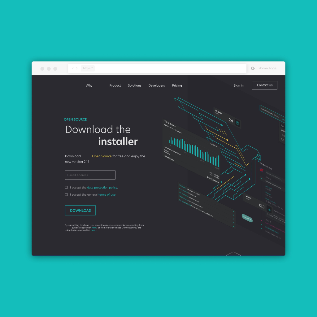
Open-source E-Commerce Ecosystem
Installer, swag store and recruitment platform
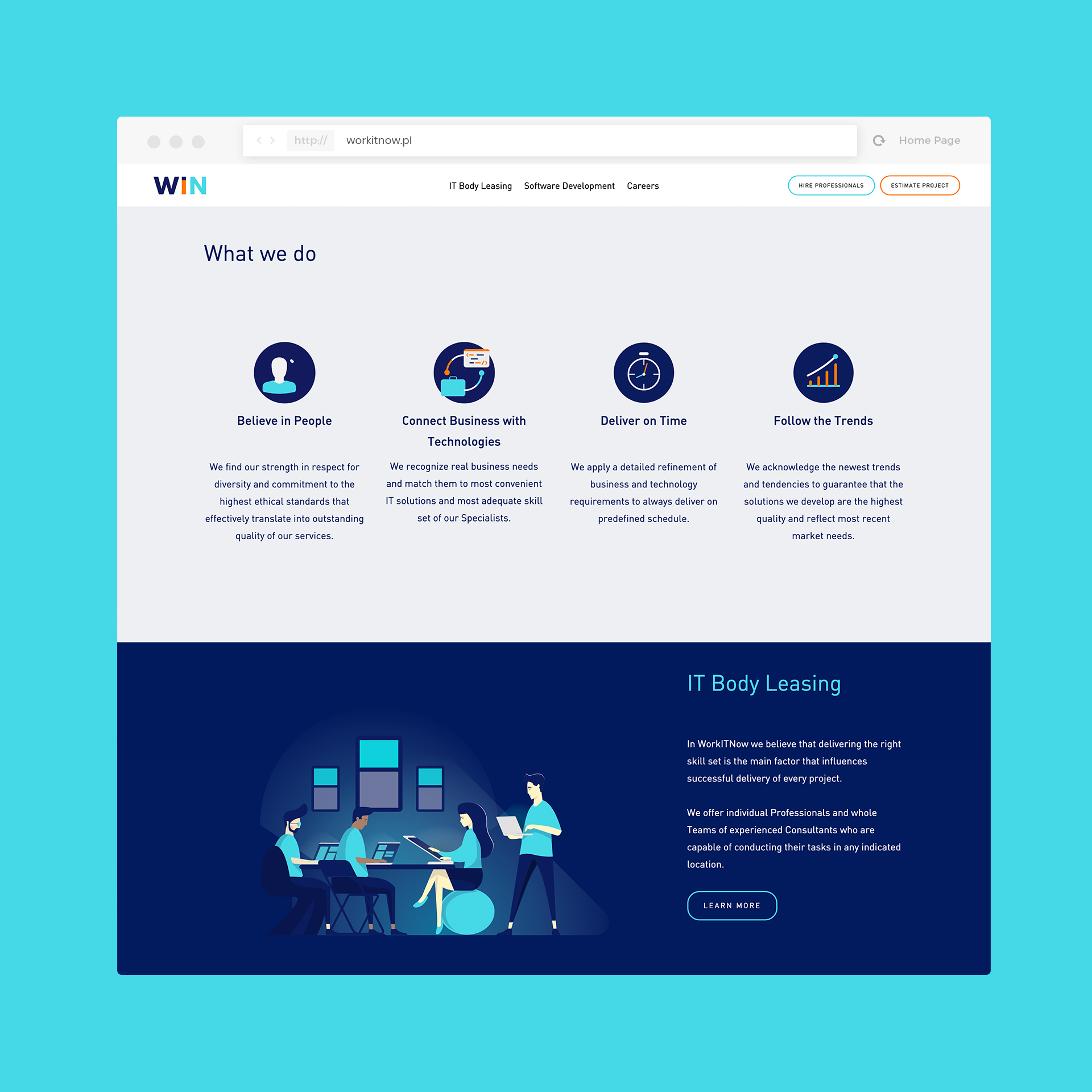
WORKITNOW
Brand website with a recruitment system for an IT company